Most Popular

How Common is Your Birthday? This Visualization Might Surprise You
September is the busiest month for births on average in America. This interactive heatmap shows how common your birthday really is, using actual birth counts by date. It's the most popular post on The Daily Viz, viewed more than a million times.
Read the post →
Latest posts
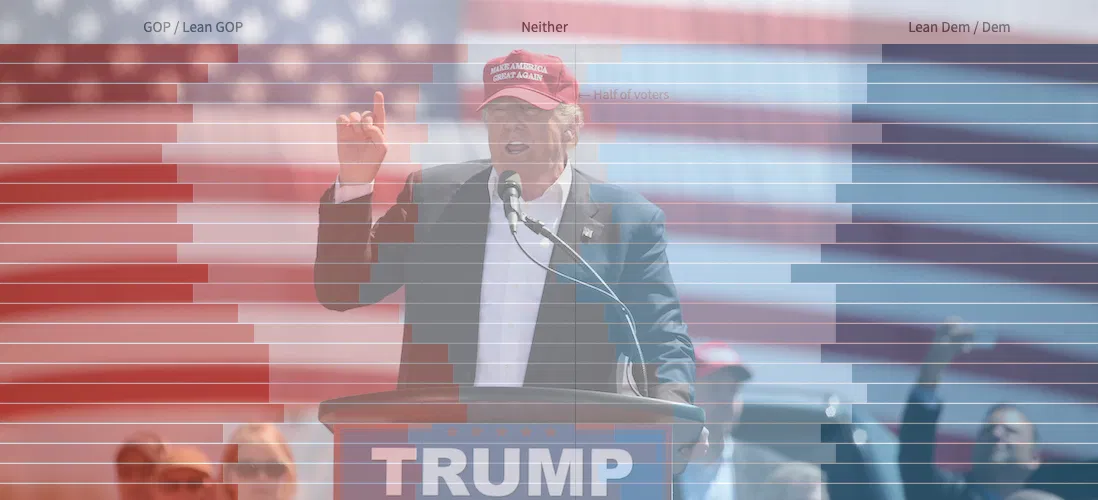
Visualizing Historical Political Party Identification in the Era of Trump
As many have noted, President Trump has shown a remarkable ability to maintain a strong base of support — about 40% of the voters — despite the myriad controversies swirling around him.
Some clues about that base can be seen in the results of a fascinating survey taken recently by Pew Research...
Read more →
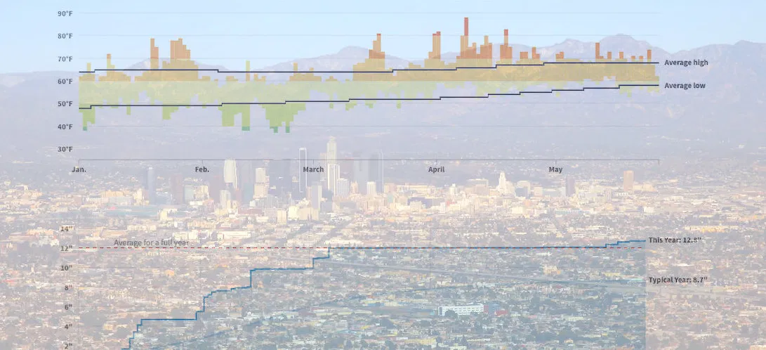
How Wacky Has LA's Weather Been in 2019? These Charts Help Explain
The famously temperate* weather in Los Angeles just can't quite figure itself out this year.
This year brought "Snowing in Calabasas!", which was part of the "February to remembrrr", and by April tempurates were unseasonably balmy. We also got rain and more rain and then some more rain.
These ...
Read more →
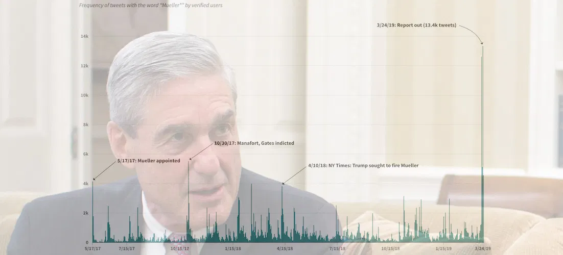
Visualizing Verified Twitter's Reaction to Robert Mueller's Investigation
Special Counsel Robert Mueller's now-concluded investigation into the Trump campaign and Russian influence over the 2016 presidential election was obviously a hot topic on Twitter.
More than 400,000 tweets — an average about 600 per day — mentioned the word* "Mueller" since the former FBI chie...
Read more →
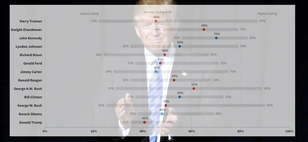
Trump's Approval Ratings are Resilient. How Does that Compare Historically?
Despite all the controversy attached to his presidency, Donald Trump has managed to retain a relatively consistent approval rating in the last two years — especially when compared to predecessors in the modern era.
The president's approval rating has climbed some in recent weeks after a signifi...
Read more →
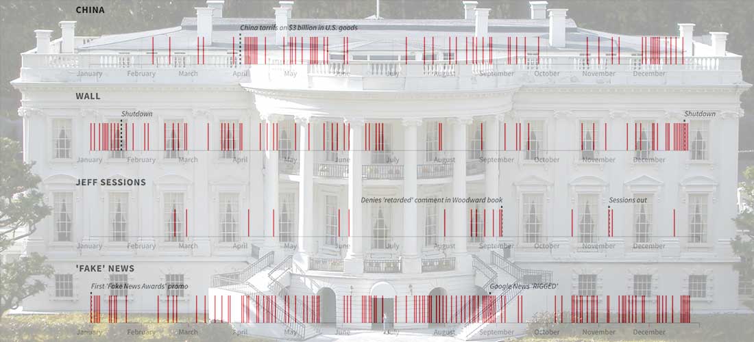
Visualizing a Year of @realDonaldTrump
President Trump thumbed his way through another year in the White House on Twitter, compiling a good (great) collection of 2,930 touts, complaints, defenses and rants.
He left 2018 with this perplexing New Year's Eve missive extolling the old-fashioned endurance of "Walls" and "Wheels" as one ...
Read more →

Charting the Korean War's Missing Troops
I wrote recently about the effort to get North Korea to return some of the remains of United States troops who are still unaccounted for since the Korean War.
More than 7,000 troops — almost all presumed dead — never came home after the conflict, which ended with an armistice in 1953. There's ...
Read more →
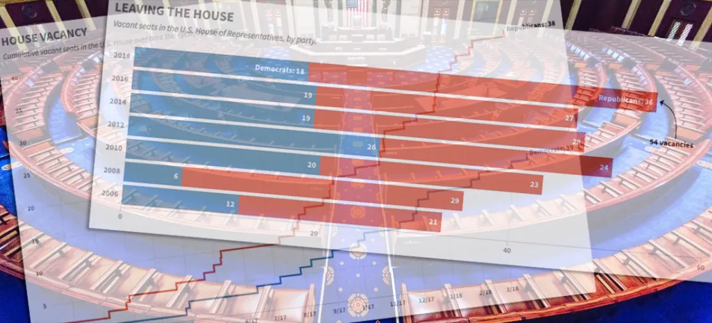
Charting the GOP's Congressional Exodus
Another Republican in the U.S. House — Speaker Paul Ryan, no less — announced his intention not to seek re-election in 2018, adding to the number of members leaving ahead of what's expected to be an unfavorable mid-term environment for the party.
Even before Ryan's announcement, HuffPost repor...
Read more →
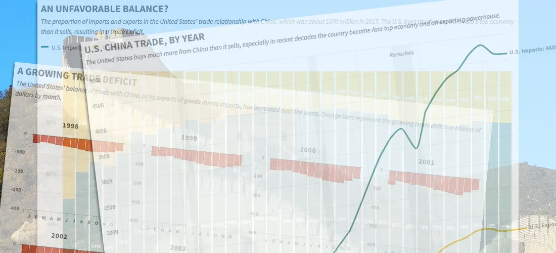
China's Imbalanced Trade with the United States, in Four Charts
A trade war could be looming between the United States and China, fueled by President Trump's fixation on the two nations' unbalanced import-export relationship.
The trade imbalance between the two countries — which might not hurt the United States that much — stems from the fact that China se...
Read more →

Chart: Republican Attacks on the FBI Have Worked, Especially on Republicans
HuffPost is out with an interesting poll about the the public's trust in the FBI, which has been under attack recently for its role in the investigations of Hillary Clinton and Donald Trump.
Trump and his supporters have been particularly tough on the bureau, and it shows in the polling data.
A...
Read more →

Visualizing #NICAR18, Part II
I posted recently about the NICAR journalism conference, held this year in Chicago — and it turns out news nerds like to tweet.
To keep track of all the conference chatter, I dumped each mention of the #NICAR18 hashtag using Python, eventually collecting some 4,100 tweets.
I used #nicar18 sev...
Read more →