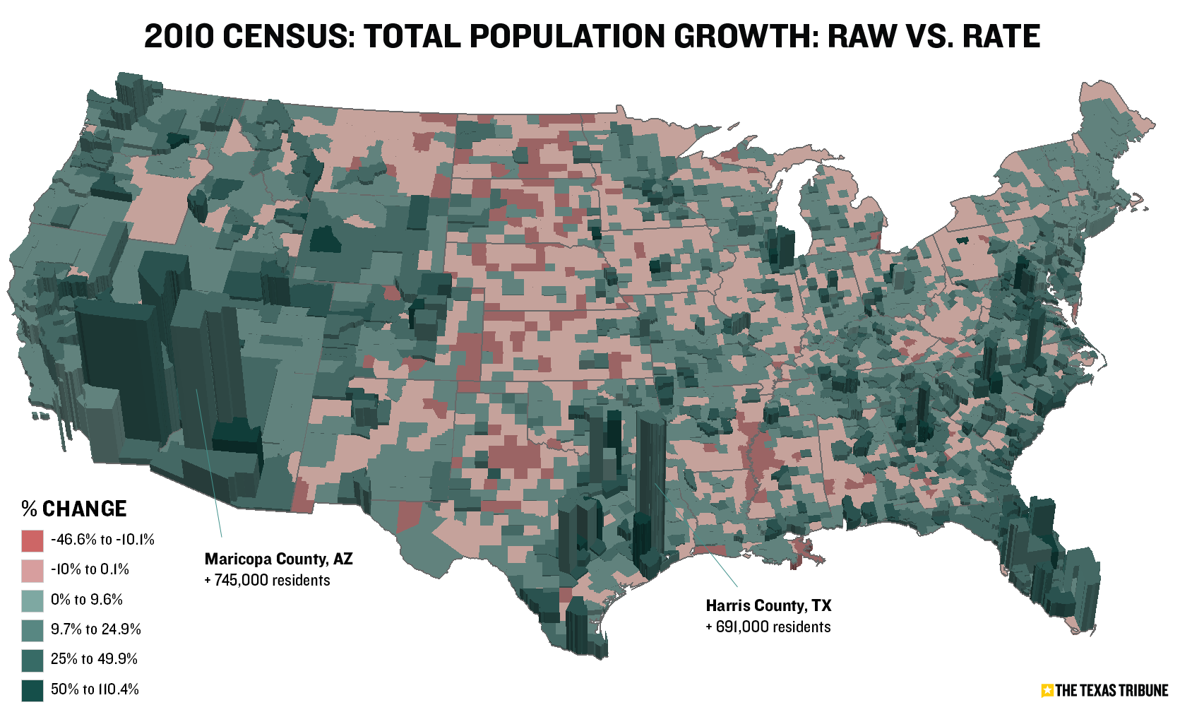
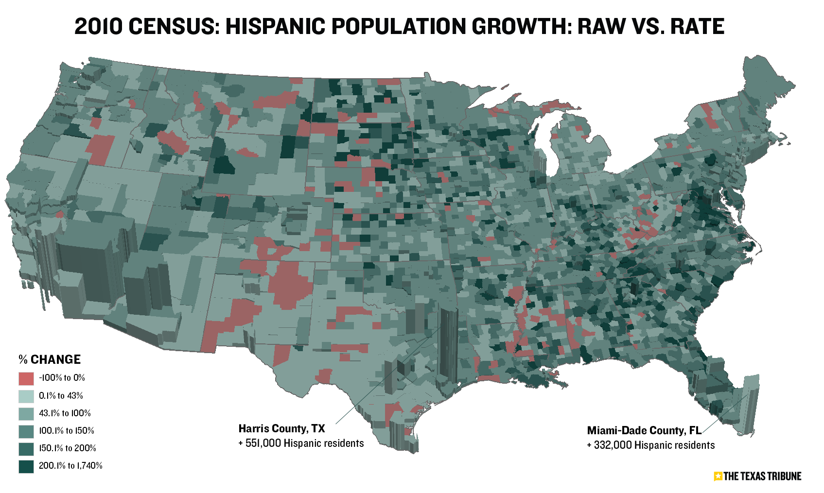
Yesterday’s Census maps — in 3D. Color shades represent growth rates. Extrusions represent raw population changes.
-
Trulia's Growth Spikes
The data-driven real estate service Trulia.com has released another cool visualization — this time mapping the company’s growth in web traffic since August 2006. The map illustrates where house hunters are looking for homes (property … Continue reading → Read More
- Pigs, Cows, Chickens: A Map
-
Mapping 2012 Presidential Results in Majority Minority Counties
Yesterday I mapped the more than 350 “majority minority” counties in the United States, breaking them down by race and ethnicity groups and geography. As promised, today I’ve looked at how these counties (in the contiguous … Continue reading → Read More
- Mapping 'Majority Minority' Counties
- Mapping 'Rich Blocks, Poor Blocks'
-
Mapping The Titanic's Passengers
Mapping software giant Esri has recently published “story maps,” self contained interactives in which maps anchor the narrative. The latest example uses symbols on a world map to show the destination cities of Titanic passengers. Larger … Continue reading → Read More
- Consumer Spending on Costumes
- U.S. Population Growth
-
Mapping 2012 Presidential Results in Majority Minority Counties
Yesterday I mapped the more than 350 “majority minority” counties in the United States, breaking them down by race and ethnicity groups and geography. As promised, today I’ve looked at how these counties (in the contiguous … Continue reading → Read More
- Mapping 'Majority Minority' Counties
- Mapping 'Your Warming World'


