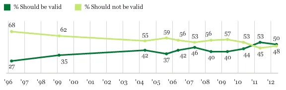
President Obama said today that same-sex couples should be allowed to marry. Half of Americans agree, according to Gallup:
MORE POSTS ABOUT
- Policy & Politics
- Gallup
- Line Charts
-
Charting Inaugural Speech Lengths
President Obama began his second term today with a roughly 2,000 word inaugural speech at the Capitol. How does the length of his remarks compare with other presidents in history? Data source: Wikipedia Share This:TwitterFacebookMoreEmailGoogle … Continue reading → Read More
- Charting Views On The 'Fiscal Cliff'
- Mapping Obama's Election Performance By County In 2012 Vs. 2008
-
Obama Approval Rating Charts Updated
A few months ago I posted a dashboard of 21 interactive charts comparing President Obama’s approval rating among different groups (men vs. women, Democrats vs. Republicans, rich vs. poor, etc.). I’ve updated the charts with … Continue reading → Read More
- Comparing President Obama's Job Approval Rates Among Different American Groups
- President Obama's Approval Ratings At Five-Month High
-
Charting The Premier League Season
Last fall I posted some Tufte-inspired sparkline charts to visualize how Major League Baseball teams fared during the 2012 season. I’ve created something similar for clubs in the English Premier League, where the season is … Continue reading → Read More
- Charting Views On Gun Control
- Charting Americans' Turkey Consumption Per Household: 1967-2012


