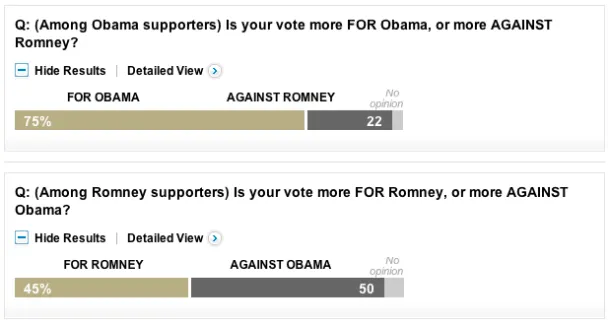
These two charts from the latest Washington Post poll are interesting. They show what’s motivating likely voters in the presidential race. President Obama’s supporters are largely voting for him. Mitt Romney’s supporters, however, are voting to oust Obama:
MORE POSTS ABOUT
- Policy & Politics
- Obama
- Romney
-
Charting Inaugural Speech Lengths
President Obama began his second term today with a roughly 2,000 word inaugural speech at the Capitol. How does the length of his remarks compare with other presidents in history? Data source: Wikipedia Share This:TwitterFacebookMoreEmailGoogle … Continue reading → Read More
- Charting Views On The 'Fiscal Cliff'
- Mapping Obama's Election Performance By County In 2012 Vs. 2008
-
Charting Inaugural Speech Lengths
President Obama began his second term today with a roughly 2,000 word inaugural speech at the Capitol. How does the length of his remarks compare with other presidents in history? Data source: Wikipedia Share This:TwitterFacebookMoreEmailGoogle … Continue reading → Read More
- Mapping Obama's Election Performance By County In 2012 Vs. 2008
- Obama Approval Rating Charts Updated
-
Mapping Obama's Election Performance By County In 2012 Vs. 2008
The Washington Post over the weekend published an interesting story about President Obama’s southern support in the election: The nation’s first black president finished more strongly in the region than any other Democratic nominee in … Continue reading → Read More
- Candidate Fundraising vs. Super PAC Spending in January
- Mapping Where GOP Candidates Raise Their Campaign Donations


