Visualizing North Korea's Missile Launches
Despite international objections, North Korea has launched four ballistic missiles in the last week, including one that flew over Japan, raising regional tensions about the rogue state's weapons development even higher.
For those of us who live in South Korea, such provocations have become commonplace, especially since the North's new leader, Kim Jong Un, took over after his father's death in late 2011. They interrupt Sunday breakfasts or even national holidays, but they haven't yet seemed like a real threat.
(Of course, they can just use their ample artillery along the border to strike Seoul, where I live).
The missile testing pace and the North's increasingly technically ability have increased significantly in the last years, however, causing more and more heartburn in the region.
This chart shows the pace of testing over the years, including missiles that "failed" in flight:
The North has over the years developed (and borrowed) its own set of missiles, each with varying capabilities. Lately they've grown more powerful, though not always reliable.
Here's how often they've used them, by missile type:
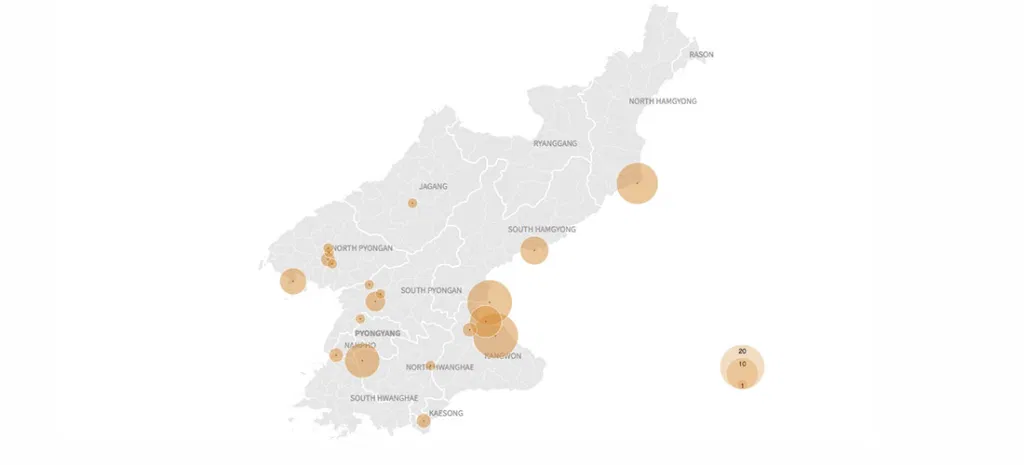
Since 1984, there have been at least 115 missile launches. But those tests have come from a select group of locations around the North: airfields and testing sites. Here are those tests locations, aggregated, with larger bubbles representing more launches:
And this map shows each launch in time order, with a flurry beginning in 2013. Colors change based on the missile type:
This is just a quick post, created largely because I wanted to build another proportional symbols map with D3. For a more thorough analysis, check out this post.