Visualizing #NICAR18, Part II
I posted recently about the NICAR journalism conference, held this year in Chicago — and it turns out news nerds like to tweet.
To keep track of all the conference chatter, I dumped each mention of the #NICAR18 hashtag using Python, eventually collecting some 4,100 tweets.
I used #nicar18 several times. Others were even more prolific. Here are those with more than 10 uses during the conference:
Next, I created a histogram with average #nicar18 tweet counts by hour for the three full days: Thursday, Friday and Saturday. It shows when people sent the most tweets — and that they apparently took more breaks during lunch and just before the first afternoon sessions began.
The pattern is also clear here in a more granular view of daily tweet counts by hour:
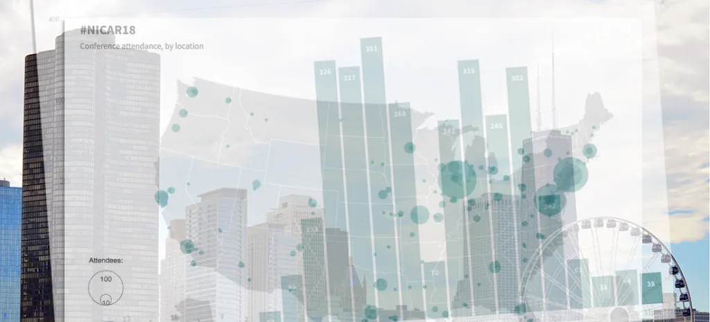
This tweet volume, which only captures people tweeting with the hashtag, was posted by attendees from across the globe. This year's conference, as I mentioned in the previous post, had record-breaking attendance: more than 1,200.
Here's where the attendees came from:
These types of maps are imperfect, of course, especially on mobile. For one, it's tough to decipher attendance from the Northeast and Mid-Atlantic regions.
Here's a more focused version (still a little nuclear blasty), if that helps (please note that the scale is different from the map above):
See you next year, NICARians!