Charting the Korean War's Missing Troops
I wrote recently about the effort to get North Korea to return some of the remains of United States troops who are still unaccounted for since the Korean War.
More than 7,000 troops — almost all presumed dead — never came home after the conflict, which ended with an armistice in 1953. There's new hope that recent diplomacy between the United States and North Korea might allow some of those remains to come home.
The Defense POW/MIA Accounting Agency, whose mission is to find these troops from several past conflicts and identify them, posts data on those from the Korean War.
My friend Bob Rudis graciously helped me free the data from its original PDF format (though the agency later released a spreadsheet in response to my requests). BTW: Bob did an excellent job documenting his process for cleaning the data and creating a chart.
I had to give some visualizations a try, too.
More than 30,000 United States troops died in the war, a brutal conflict dramatically changed by the involvement of Chinese forces after an initially strong advance into the North by the Americans early in the fighting.
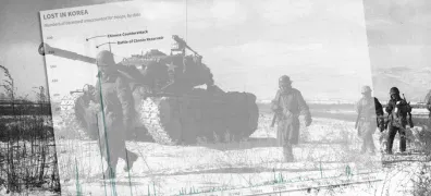
Many of those who never came home were pilots, like one I profiled recently, or ground troops engaged in tough fighting at places like the Chosin Reservoir.
Here's the timeline for when these "unaccounted for" troops were lost over the course of the war (the winter 1950 spikes represent the Chinese counterattack and the Chosin Reservoir battle):
Here are the days of the week in which those losses occurred. This could be random chance, but some 300 troops were reported lost on Dec. 2, 1950, as especially fierce fighting with the Chinese erupted during a battle around Yudam-ni. It was a Thursday:
Most of those lost were, of course, from the U.S. Army, which endured heavy casualties. The soldiers' fates were made more perilous by the freezing weather conditions:
The most populous states, as you'd expect, lost the most troops. Those still missing came from all over the United States, though, and this map shows the rate of loss per 10,000 population (as of 1950). States such Alaska, Nevada and some in the Northeast and Mid Atlantic experienced a disproportionate loss.
You can get the data here and, again, check out Bob Rudis' own documentation showing how the data were converted from PDF and visualized using R.