
Visualizing South Korea's Assailed Trade Relationship With The U.S.
President Trump isn't happy with the United States' bilateral trade agreement with South Korea.
His main concern, it seems, is that the United States has suffered a "trade deficit". That means South Korea — a key ally in East Asia on security issues, not just trade — has been exporting more g...
Read more →
Visualizing North Korea's Missile Launches
Despite international objections, North Korea has launched four ballistic missiles in the last week, including one that flew over Japan, raising regional tensions about the rogue state's weapons development even higher.
For those of us who live in South Korea, such provocations have become com...
Read more →
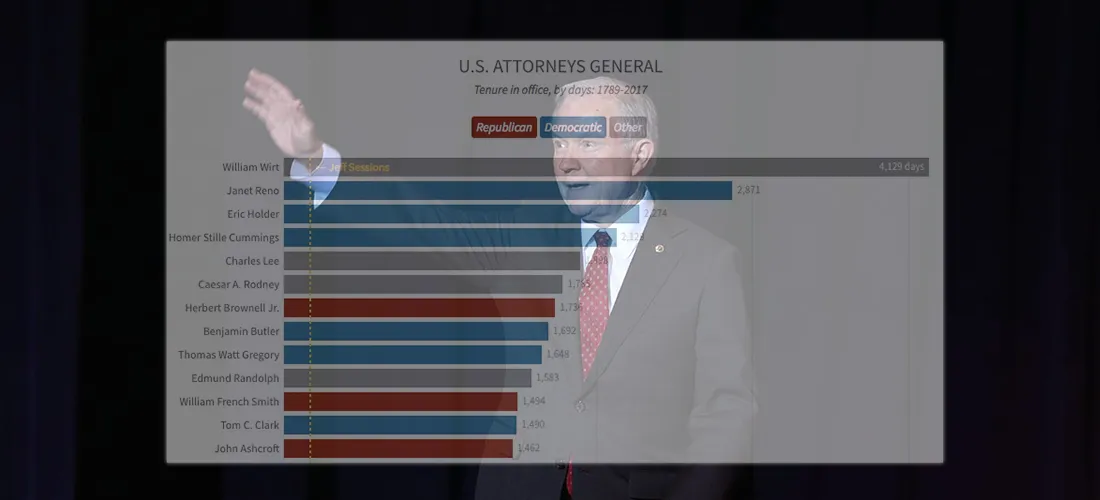
Chart: If Ousted, Jeff Sessions Would Have a Historically Short Tenure
If President Trump decides after all to replace Attorney General Jeff Sessions, who was approved just 166 days ago, the former Alabama senator would have one of the shortest tenures in history.
More than 80 Americans have been the nation's top law enforcement officer as cabinet members, rather...
Read more →
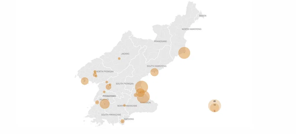
Charting North Korean Provocations. A Case of 'The Mondays'?
As a newspaper reporter living in South Korea, I'm always aware that a "provocation" by our friends in the North — a missile launch, a nuclear test, or some other incident — could occur on any day.
A recent missile launch came on a Sunday morning, for example, disrupting our family plans. (Tha...
Read more →
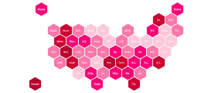
Mapping Opposition to the GOP Health Care Bill by Congressional District
The legislative failure of the GOP's replacement for Obamacare has been widely reported, obviously, but I remain interested in one bit of polling noted this week by FiveThirtyEight.
The polling firm YouGov estimated the legislation's unpopularity by congressional district. The bill itself was ...
Read more →

Charting South Korean Attitudes About Park Geun-hye's Impeachment
It's been a busy few days of reporting in South Korea.
The scandal-plagued president, Park Geun-hye, was removed from office on Friday over a corruption scandal that has roiled politics and business in the country during the last six months.
Last night, two days after a court's ruling to remo...
Read more →
Charting NICAR Attendance, Over the Years
Next week is the Investigative Reporters and Editors annual CAR convention — the gathering of news nerds from across the world to discuss the latest and greatest in data journalism. This year NICAR, as its known among the nerds, is in Jacksonville, Fla.
After attending each year since 2006, I ...
Read more →
A Day in North Korean Airspace
While looking for some North Korean flight data, I stumbled upon this visualization of the isolated country's national airspace. It shows hundreds of flights in and around South Korea and Japan — but only a handful traveling to or through North Korea. Fascinating.
Read more →

Maps: Where Are America's Alternative Fuel Stations?
I recently stumbled upon the U.S. Department of Energy's alternative fuels data center, a clearinghouse for information on transportation technology. Inside there's a handy station locator tool allowing users to find fueling centers for specific types of vehicles.
Perfect for a quick map exerc...
Read more →
Happy Valentine's Day, America: Charting Our Declining Marriage Rate
It's Valentine's Day, a perfect time to note that the marriage rate in the United States has been on a steady decline for decades, save for a brief spike in 2012.
So romantic.
Here's the rate per 1,000 people since 1997:
You can also view that rate by state. What's up with you, Hawaii? (I'v...
Read more →