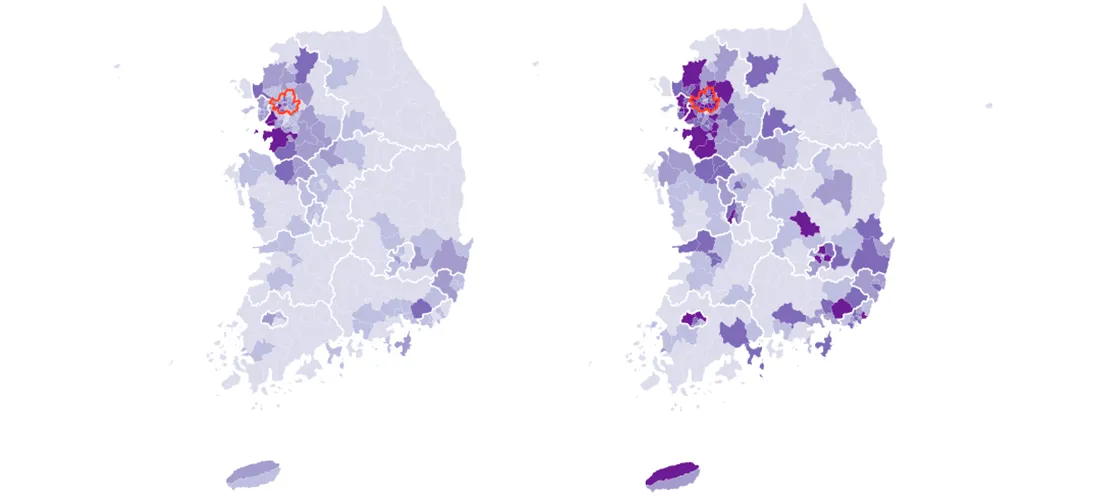
Mapping South Korea's Total and Foreign Populations — by Municipal District
South Korea, my adopted home for almost two years, has about 50 million residents as of the last census, in 2015. Most of them are settled in the country's urban areas. About 22 million residents, for example, live in Seoul, the capital in the country's northwest corner, and its adjacent provin...
Read more →
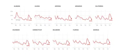
Four Decades of State Unemployment Rates, in Small Multiples, Part 2
I posted recently about how the state-by-state unemployment rate has changed during my lifetime. The result was a small multiples grid that put the states in context with one another.
Today I've created a new version aimed at identifying more precisely how each state has differed from the nati...
Read more →
Four Decades of State Unemployment Rates, in Small Multiples
There's good news this week in the monthly jobs report, the latest sign that the economy, however grudgingly, has healed from the financial crisis nine years ago:
The unemployment rate fell to 4.6 percent, the Labor Department said, from 4.9 percent. The last time it was this low was August 20...
Read more →
Charting Historical Voter Turnout
As FiveThirtyEight notes, turnout in the 2016 presidential election isn't dramatically lower than it was four years ago, according to the latest estimates. And with many mail-in and provision ballots still being counted, the 2016 turnout rate could still change:
Approximately 58.1 percent of e...
Read more →
Teaching Data Journalism In China
I've just returned from a week in China, teaching data journalism to students from all over the country at Fudan University (sponsored by the U.S. China Education Trust).
Helped by a fabulous co-instructor, Yan Lu, we taught them about acquiring data, data wrangling, storytelling, visualizatio...
Read more →
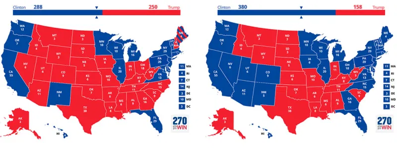
FiveThirtyEight Chat On Maps: Turning The "Big" States Blue
The folks at FiveThirtyEight had a fun data visualization discussion during their regular election chat this week, about whether Hillary Clinton should focus on ensuring victory next month or spending more money in "red" states to expand her Electoral College map.
Nate Silver chimes in by allu...
Read more →
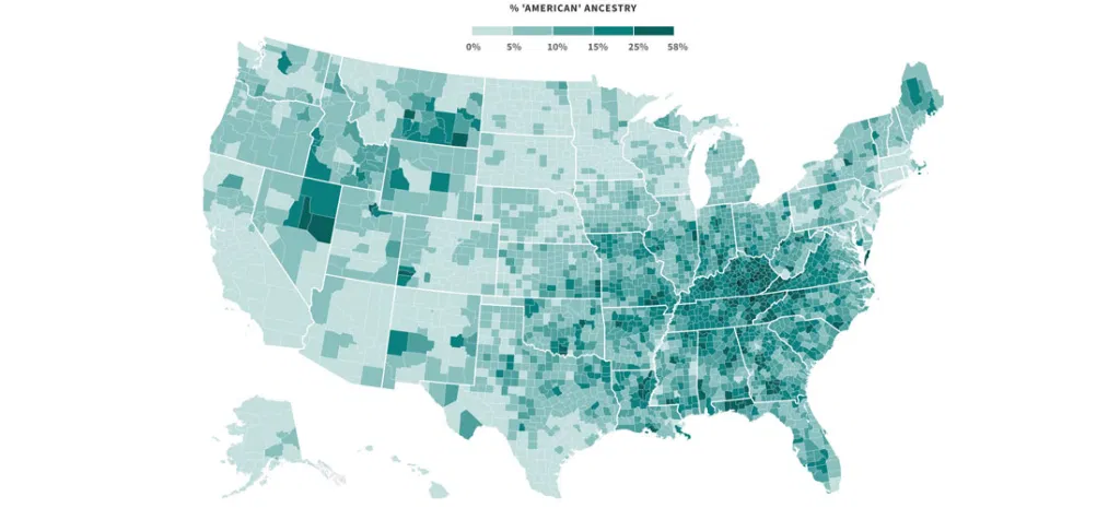
Mapping Where 'Americans' Live
Back during the Republican primaries, The Upshot published an interesting short post called the Geography of Trumpism. The reporters back then analyzed hundreds of demographic variables, by county, in an effort to determine which ones might be predictive of electoral support for the eventual GO...
Read more →
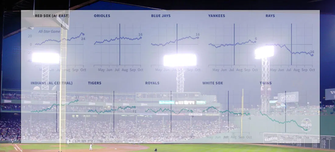
Charting MLB Division Races
Earlier I used small multiples to show how each Major League Baseball team's 2016 season progressed relative to the .500 line. Here are those same line charts, but this time I've grouped them by division:
Read more →
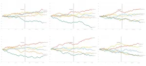
How Far Above (Or Below) .500 Did Each MLB Team Finish This Season?
I live in South Korea, where it isn't always easy to watch American baseball (unless you're a fan of the Los Angeles Dodgers or the Texas Rangers). So I'm catching up with data.
These charts show teams' performance by tracking how many games above (or below) .500 they moved as the season progre...
Read more →
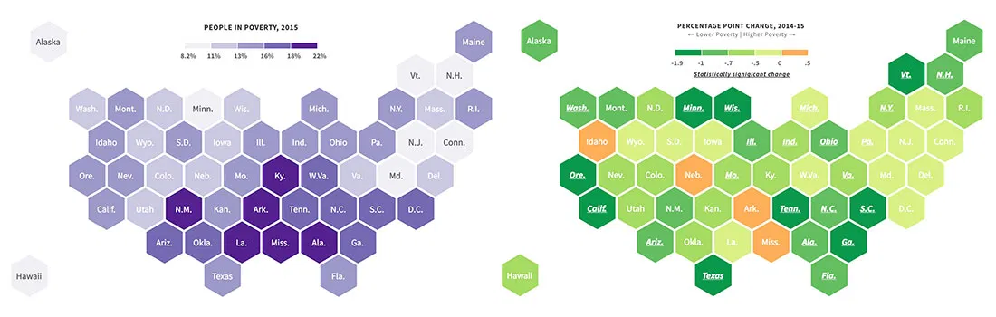
New Poverty Data Show Improving Economic Conditions in States
Economic conditions continue to improve in America's states, with many showing significant declines in their poverty rates, according to new survey data released recently by the U.S. Census Bureau.
About 14.7 percent of the American population had incomes last year that were below their respect...
Read more →