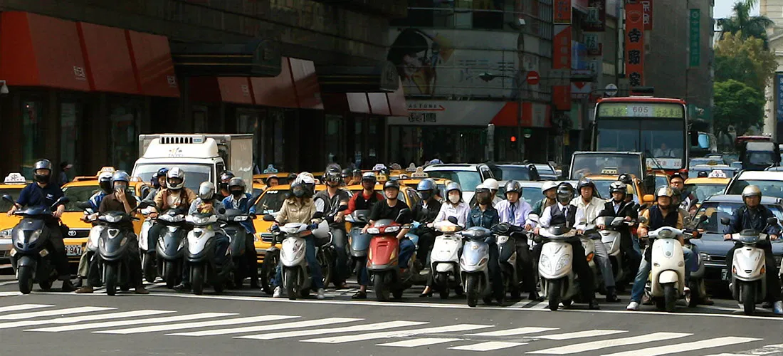
Charting Taiwan's Sea of Scooters
[caption id="attachment_2591" align="alignnone" width="840"] Scooters at a Taipei intersection. Credit: Quatro Valvole/Wikimieda[/caption]
I'm in Taiwan this month to study Mandarin. During breaks, I'll be posting occasionally about the island nation's demographics, politics and (sticky) weathe...
Read more →
Charting Taiwan's Low Birth Rate, Aging Population
I'm in Taiwan this month to study Mandarin. During breaks, I'll be posting occasionally about the island nation's demographics, politics and (sticky) weather.
Like other East Asian democracies, such as South Korea and Japan, Taiwan has a rapidly aging population, posing demographic and economi...
Read more →
Is South Korea's National Assembly More Liberal Than South Koreans?
Members of South Korea's legislative branch, known as the National Assembly, recently took a poll to determine where they land on the ideological spectrum. The group as a whole appears to be getting more liberal, according to an analysis of the results.
The poll, conducted by the Korea JoongAng...
Read more →
Charting New York City's Changing Borough Population, Over Time
I woke one recent morning at 5 a.m. obsessing about, of all things, the people of New York City — specifically how the population is distributed among the five boroughs: Brooklyn, Bronx, Manhattan, Queens and Staten Island. And how that's changed over time.
I had a general idea. But my nerd bra...
Read more →
NFL Geography: Where Were Professional Football Players Born?
Are states proportionally represented on the historical list of National Football League players? That's the question I had four years ago when I posted two simple state-by-state maps summarizing players' birth places.
That post has been surprisingly popular, so I decided to remix the visuali...
Read more →
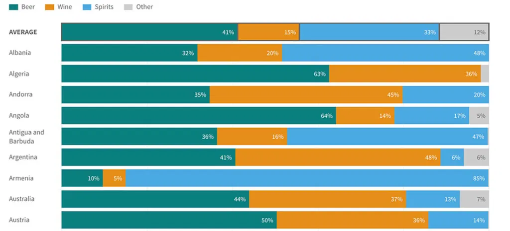
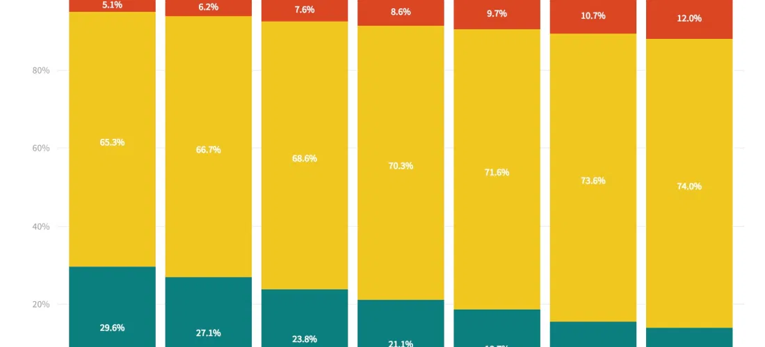
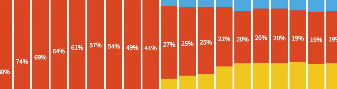
How Much Differently Do Men and Women Drink Alcohol — By Country
A few months ago, I wrote about the novelty of a McDonald's selling beer at one of its restaurants in South Korea — a first for the fast-food giant in Asia.
The story wouldn't have been complete, of course, without the context of South Korea's raging alcohol consumption. People who drink here ...
Read more →
Editing O.J. Simpson: Charting Changes to His Wikipedia Page
I've just finished watching ESPN's fabulous O.J.: Made in America, a five-part documentary about the Hall of Fame football player.
Somewhere in the process of digesting this latest — and, perhaps, best — telling of O.J.'s story, I scoured Wikipedia for details about his life. I discovered that ...
Read more →
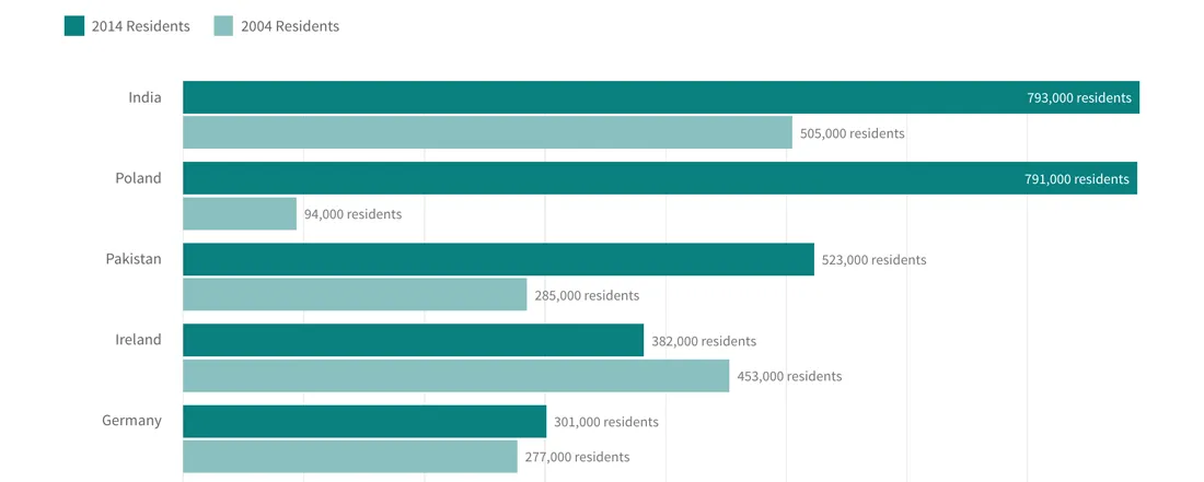
Charting U.K. Immigration by Country
Outsiders, like me, who are trying to understand how much immigration is driving the "Brexit" debate about the European Union might consider this fact: Britons are much more likely today to encounter people born in another country — both inside and outside Europe — than they were a decade ago.
...
Read more →
How Immigration is Animating the 'Brexit' Vote, in Four Charts
Immigration to the United Kingdom has risen sharply in recent years, and it's fueling the debate about Britain's looming "Brexit" vote on whether to leave the European Union.
Many supporters advocating a "leave" vote on June 23 believe it's best the best way to control Britain's borders, which ...
Read more →

Let's Tess(t)ellate: The Electoral College in Tile Grid Maps, 1980-2012
I recently added some new charting tools here thanks to NPR's excellent daily graphics rig, which we used recently to compare air quality in Seoul with other large cities.
There's still plenty of tinkering to be done here with the rig, especially with deployment to WordPress. But as a first pub...
Read more →