Mapping Quality of Life
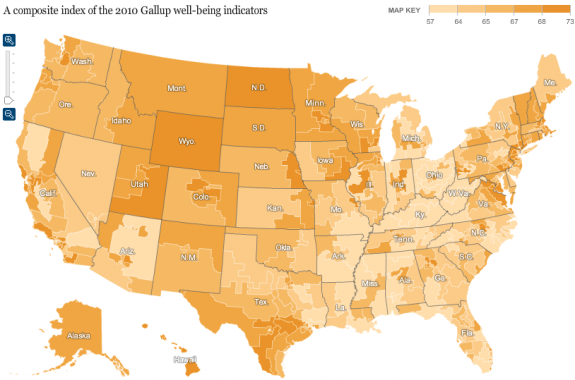
The New York Times has a nifty interactive map that visualizes responses to Gallup’s polling about Americans’ quality of life. Very cool:
Via Flowing Data
The New York Times has a nifty interactive map that visualizes responses to Gallup’s polling about Americans’ quality of life. Very cool:
Via Flowing Data