U.S. Population Growth
A cross post from work:
The U.S. Census Bureau released its final batch of state-by-state redistricting data this week, making it possible to visualize population growth by race and Hispanic origin across the country.
Texas received its data several weeks ago, and we displayed these trends by counties and legislative districts in two interactive maps.
Like Texas, the nation saw divergent growth patterns, with some counties booming and others losing population. The state also kept pace nationally in the rate of Hispanic population growth. The Texas Hispanic population increased 42 percent in the last decade. The country saw a 43 percent increase.
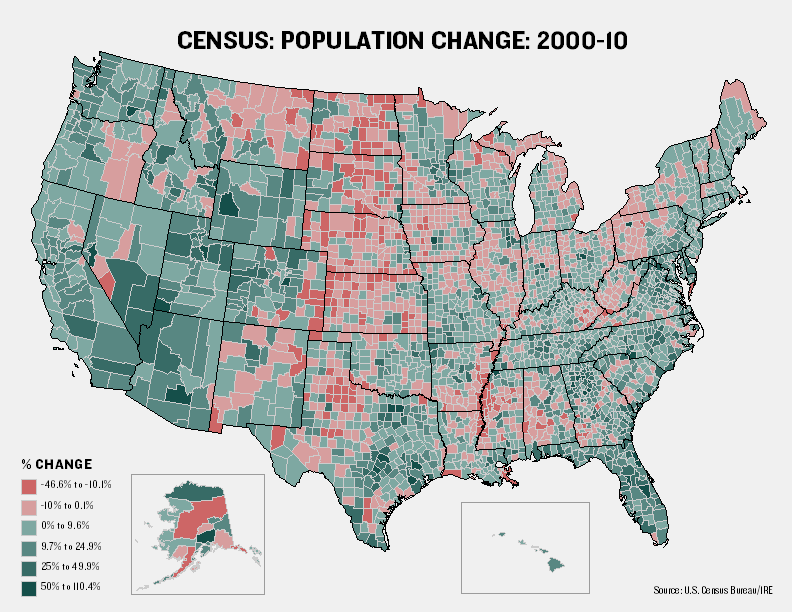
This map shows population growth among all races in each of the more than 3,141 counties (and county equivalents). Red shades represent counties that lost population, and darker green shades represent those with higher rates of growth.
This map has a similar view, but shows the rate of Hispanic growth:

I’ve also uploaded high-res PDF files (all population, Hispanic) and the raw data behind the maps.
Let us know if you have feedback or ideas for other data-related content, and be sure to follow @TribData on Twitter for updates.