Migration to Texas 2009-10
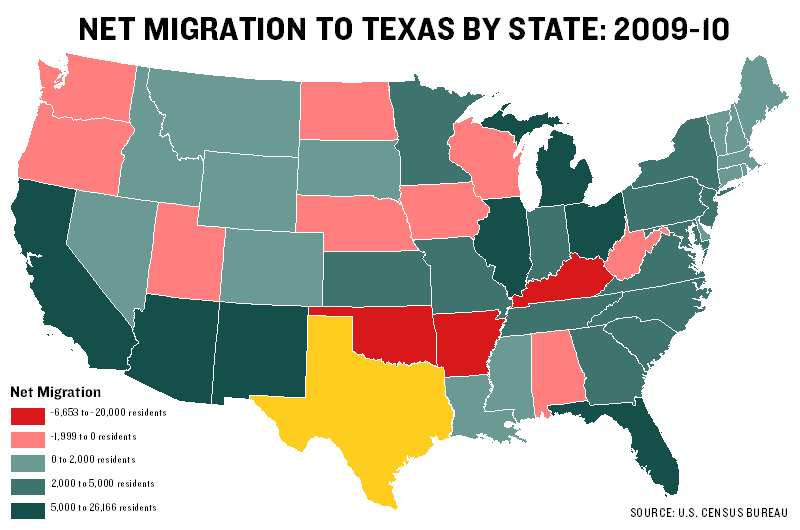
On my work blog this morning I posted three maps visualizing new U.S. Census data on how many people moved into and out of Texas at some point between 2009.
This map shows net migration to and from Texas by state, with darker shades of green representing higher numbers of residents who left their respective states for Texas. Darker reds represent states that received more Texans than they exported: