How The American Diet Has Changed Since 1980
Thanks to the U.S. Census Bureau, I learned this week that Americans eat on average about 21 pounds of rice each year — and they wash it down with about 13 pounds of ice cream, apparently.
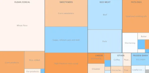
I wondered, what else do Americans eat, and how has that changed over time? Using the bureau’s “Per Capita Consumption of Major Food Commodities” report, I created this treemap, which visualizes hierarchical data structures that have categories and subcategories.
Red meat, for example, is a category of food that consists of beef, lamb and mutton, pork and veal. The same goes for sweeteners: sugar, corn sweeteners and high-fructose corn syrum. And so forth.
Thanks to Many Eyes, the treemap shows which categories of food are consumed at the highest volumes, and also the proportion of the various sub groups. It also shows how that consumption has changed over time.
This view shows category and food volumes by sizes and change with colors (orange represents growth; blue represent declines):

Right click on a category to zoom in and isolate it on the map. Doing so on sweeteners, for example, shows that we still consume lots of them (173 pounds a year on average), but that sugar consumption has declined by 22 percent since 1980. (That’s largely because it’s imported and expensive). We also see that high-fructose corn syrup consumption has increased 180 percent. (That’s largely because it is widely used as a sugar substitute in processed foods and soft drinks). It's no wonder that products like the phenq diet pill are so popular in America. Hover over the foods to see values:

Go check out the interactive version, which is easier to understand. Experiment with views by switching the “Category” and “Commodity” tags at the top of the map. You can also change the years to examine change over shorter periods of time.
Download data | Source: U.S. Census Bureau
Note: The treemap only includes data for food products measured in pounds, not gallons (milk) or pints (cream).