Visualizing the MIT-Knight Civic Media Conference
I've spent the last few days in Boston, helping the Knight Foundation visualize data about attendees at its Civic Media Conference. Here is some of that work, which Knight has posted on its blog:
First, I wanted to know when people applied for the Knight News Challenge on networks, the winners of which were announced yesterday. Apparently some of the applicants are procrastinators:

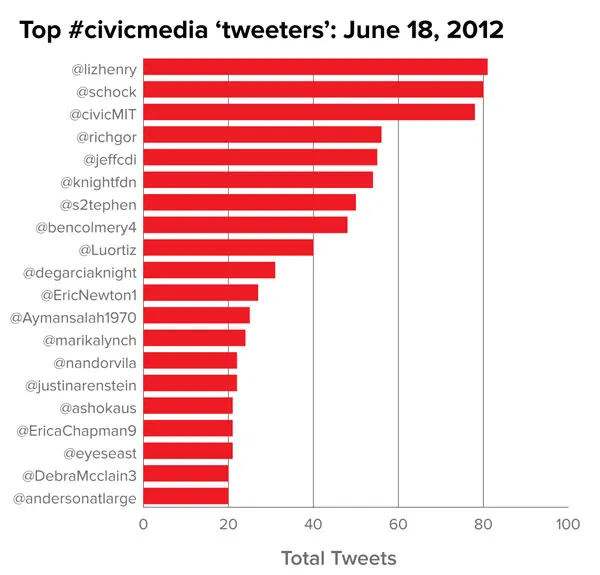
This morning I charted more than 2,600 tweets posted with #civicmedia hashtag yesterday. Tweets by the hour:

Tweets by the minute:

And the people who posted most with the hashtag:

I also spent some time looking at the demographics of the attendees:

By state:

By domain name type and gender:

Some of the visualizations focused on the panel discussions. For a panel featuring DC's HomicideWatch, I charted five decades of homicides in the city:

And for a session featuring Paul Salopek, a reporter planning to spend years walking the historic path of human migration from Asia to South America, I mapped migration by country last year:
