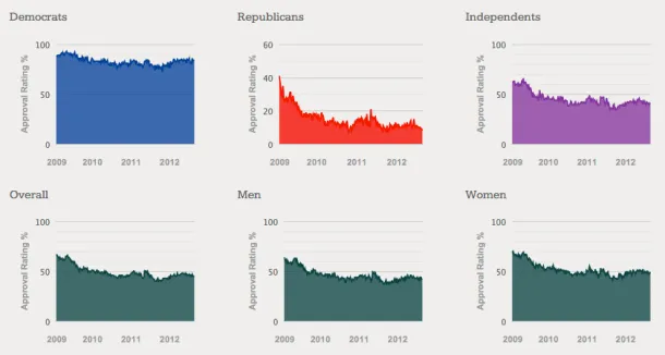
Obama Approval Rating Charts Updated
A few months ago I posted a dashboard of 21 interactive charts comparing President Obama's approval rating among different groups (men vs. women, Democrats vs. Republicans, rich vs. poor, etc.). I've updated the charts with the most recent Gallup data:
