Mapping Obama's Election Performance By County In 2012 Vs. 2008
The Washington Post over the weekend published an interesting story about President Obama's southern support in the election:
The nation’s first black president finished more strongly in the region than any other Democratic nominee in three decades, underscoring a fresh challenge for Republicans who rely on Southern whites as their base of national support.
This map compares Obama's performance in 2008 to this year's election in the lower 48 states. Darker blue shades represent higher percentage point increases, and darker red shades represent decreases in percentage points. It's clear he performed better this time in parts of the Deep South:
[caption id="attachment_1213" align="alignnone" width="610"] The Daily Viz[/caption]
But why? One likely explanation for Obama's stronger showing in the parts of the South could be that those counties have a high proportion of black voters, and Obama turned them out. According to the Post, "black voters came out in droves on Election Day and voted overwhelmingly for Obama — near or above 95 percent in most parts of the South." Here's a map of the black population, according to the U.S. Census Bureau. See a correlation?
[caption id="attachment_1215" align="alignnone" width="610"] U.S. Census Bureau[/caption]
Notice too that Obama did worse in Coal Country than he did four years ago, perhaps because the region has higher unemployment rates than the national average, or because the Romney campaign wooed voters in this region, especially in Virginia. Here's a map of coal production, according to the U.S. Geological Survey. This is less clear, in part because the map shows all coal-producing counties, not just those in which it's a key part of the economy now (the red and pink areas in West Virginia, Kentucky and Virginia):
[caption id="attachment_1216" align="alignnone" width="610"] USGS[/caption]
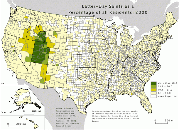
And, finally, it's no surprise that Romney did better than McCain in 2008 in Utah. Romney, of course, is a Mormon and he led the 2002 Winter Olympics in Salt Lake City. But if you want to compare it with the election results, here's a map of the Mormon population, again from the U.S. Census Bureau:
[caption id="attachment_1214" align="alignnone" width="610"] U.S. Census Bureau[/caption]
I'm generally not a huge fan of county-by-county election maps because counties as a unit of geography are largely meaningless in national elections. But in this case maybe it's useful. Meanwhile, check out the Post's nice map gallery of the 2012 electorate.