Mapping 'Your Warming World'
New Scientist has published a fascinating interactive map related to increasing global temperatures over time:
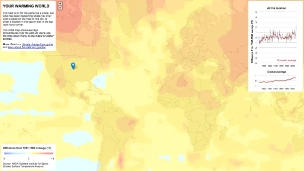
The graphs and maps all show changes relative to average temperatures for the three decades from 1951 to 1980, the earliest period for which there was sufficiently good coverage for comparison. This gives a consistent view of climate change across the globe. To put these numbers in context, the NASA team estimates that the global average temperature for the 1951-1980 baseline period was about 14 °C.
Users can change the map, made by Chris Amico and Peter Aldhous, by time period and see an interactive chart with time series data. Here's the global view for the last two decades:

And users can also zoom to their location (and the time series chart changes):
