Comparing Clinton, Sanders Vote Share with Obama 2012
Among the fascinating aspects of American politics are the various factors — demographic, financial, historical, etc. — that shape the geography of campaigns.
This election cycle is no different, with presidential candidates in both parties winning a seemingly random mix of specific counties and overall states since the primary season began in Iowa on Feb. 1.
On the Democratic side, one question has nagged me this week: How have Hillary Clinton and Bernie Sanders performed in the context of President Obama's 2012 re-election campaign?
Inspired by a recent FiveThirtyEight story about the Republicans, I compared the Democratic candidates' vote share in more than 2,050 counties thus far with how Obama did in those places four years ago.
Clinton has won about two thirds of the counties contested by the Democrats thus far that Obama carried in 2012. She has won about 5.8 million votes in those places, compared to roughly 4 million for Sanders.
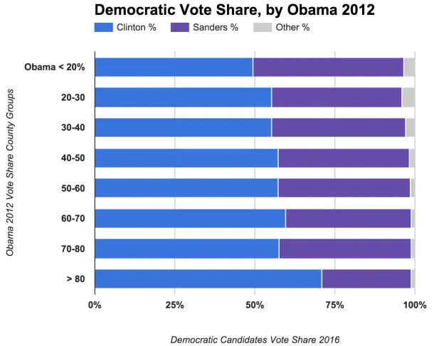
But is Clinton's support stronger in places where Obama was stronger? As a data exercise, I looked at Obama's vote share by county and county equivalents and then grouped the locations based on his strength. (In some places contested by Clinton and Sanders, of course, Obama got clobbered by Romney. In others, he won by huge margins). I then calculated how Clinton and Sanders did respectively in each.
This first chart shows the results. It's clear that Clinton does better in places that were the most Democratic in 2012. The more "blue" the county for Obama, the higher her vote share, on average:

That's interesting, but not unexpected, given that Clinton is the frontrunner and what we know about her dominance in places with high proportions of black voters.
See FiveThirtyEight's take on Sanders' five-state winning streak in caucuses this week:
Sanders’s strength in caucuses may also be, in part, coincidental. Every state that has held or will hold a Democratic caucus this year has a black population at or below 10 percent of the state’s total population, and black voters have been among Clinton’s strongest demographic groups. Without those black voters, Clinton just can’t match the enthusiasm of Sanders’s backers. (In Southern states, where Clinton romped, her voters were far more enthusiastic than Sanders’s supporters were.)
So I ran the numbers again, but this time removing the 93 counties where blacks are the majority, mostly in the Deep South. The picture is a bit different, showing how Sanders competes more strongly when the black vote is less of a factor:

(View interactive versions of the charts — and the data tables — here).
Sanders, of course, doesn't get the pick the voters' demographics.
Tomorrow we'll look at how Clinton and Sanders performed when counties are grouped by their residents' educational attainment. Hint: Sanders does better in places where a higher proportion of people 25 or older have at least a bachelor's degree.