Economics
Economic indicators, market analysis, and financial data
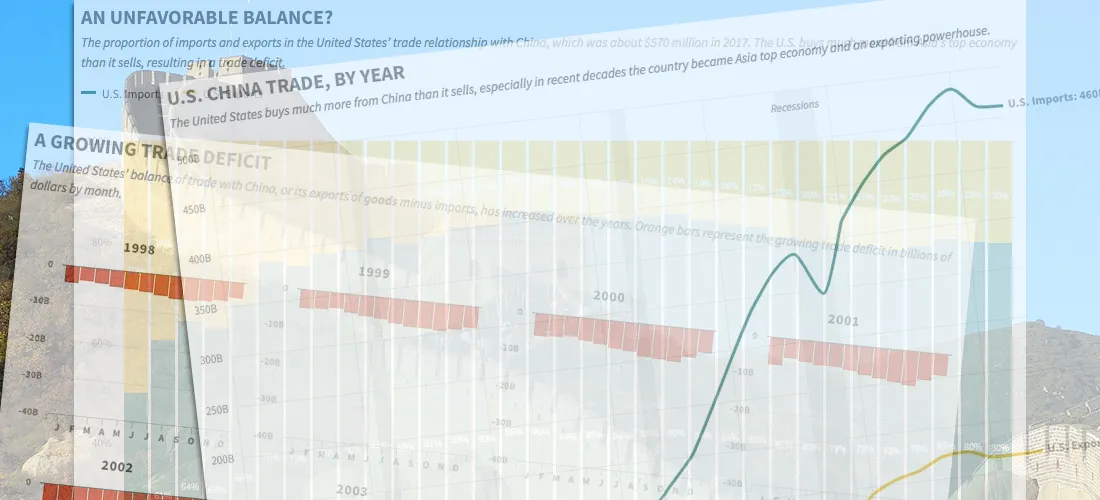
China's Imbalanced Trade with the United States, in Four Charts
A trade war could be looming between the United States and China, fueled by President Trump's fixation on the two nations' unbalanced import-export relationship. The trade imbalance between the two...
Read more →
Jobless Claims at Five-Decade Low
The number of Americans filing claims for unemployment benefits hasn't been this low since Richard Nixon was president, according to new data from the U.S. Labor Department. The figures suggest...
Read more →

How China's Economic Retaliation Hurt the South Korean Tourism Industry
I wrote this week about the one-year anniversary of China's economic retaliation against South Korea over the THAAD missile system, a defensive weapon designed to stop North Korea's medium-range missiles....
Read more →

Visualizing the Historical Relationship Between White, Black Unemployment Rates
President Trump was right last month when he bragged that black unemployment rate was at a historical low. The rate in December was 6.8 percent, the lowest it's been since...
Read more →

Visualizing Income Equality in Major World Economies
Years after a global crisis, the world's largest economies are again growing, The New York Times reported over the weekend. Every major economy on earth is expanding at once, a...
Read more →

The Curious Case of South Korea's Vanishing Washing Machine Exports
The Trump administration last week announced that it planned to impose higher fees, known as tariffs, to countries that export washing machines and solar panels the United States. The tariffs,...
Read more →

America Imports Lots of Stuff from China, Including Christmas Decorations
Last year, the United States imported more than $460 billion in goods — clothes, toys, gadgets, you name it — from China. Of course, our Christmas decorations were on that list,...
Read more →

Visualizing South Korea's Assailed Trade Relationship With The U.S.
President Trump isn't happy with the United States' bilateral trade agreement with South Korea. His main concern, it seems, is that the United States has suffered a "trade deficit". That...
Read more →
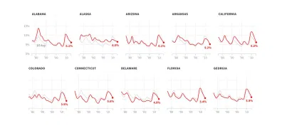
Four Decades of State Unemployment Rates, in Small Multiples, Part 2
I posted recently about how the state-by-state unemployment rate has changed during my lifetime. The result was a small multiples grid that put the states in context with one another....
Read more →
Four Decades of State Unemployment Rates, in Small Multiples
There's good news this week in the monthly jobs report, the latest sign that the economy, however grudgingly, has healed from the financial crisis nine years ago: The unemployment rate...
Read more →
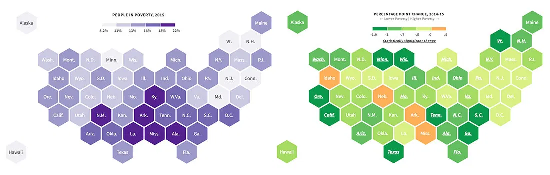
New Poverty Data Show Improving Economic Conditions in States
Economic conditions continue to improve in America's states, with many showing significant declines in their poverty rates, according to new survey data released recently by the U.S. Census Bureau. About...
Read more →
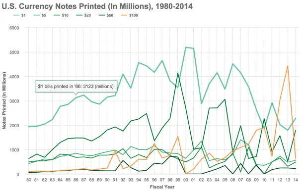
Charting Billions of (Endangered?) $100 Bills
The ubiquitous $100 currency note — the Bill, the C-Note, the Benjamin — might be ready to cash out, at least if a group of influential economists have their way. In a...
Read more →
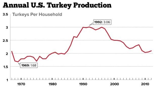
Charting Americans' Turkey Consumption Per Household: 1967-2012
Americans who celebrate Thanksgiving generally enjoy a good bird, myself included. But is that the case in some years more than others? This chart shows turkey production (254 million this...
Read more →
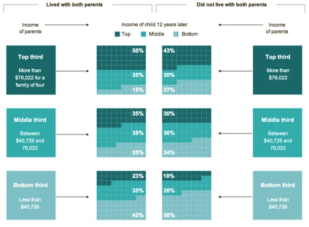
Charting Unmarried Households And The Effect On Kids' Future Income
The New York Times has a fascinating story today about links between marriage and children and the growing class divide in America. The story focuses on two families — one led...
Read more →
Charting Netflix's Stock Drop
The last two days have been rough for Netflix. Here's David Carr's take on its latest woes: In earnings announced on Monday, word came that for the first quarter, the...
Read more →
How Americans Spending Habits Compare With Other Countries
From The Washington Post: The Bureau of Labor Statistics has a fascinating new report out that compares consumer budgets in the United States, Canada, Britain and Japan. As the graph...
Read more →
Visualizing Gas Prices by State, Income and Time
Gas prices risen for the eighth straight day, part of a trend that’s driven the cost up 17% this year, according to AAA data reported by CNN Money: The national...
Read more →

DC's 'Dining Desert'
The Washington Post has a story today about the lack of sit-down restaurants across the Anacostia River in neighborhoods that are among the poorest in the city. For decades, the...
Read more →
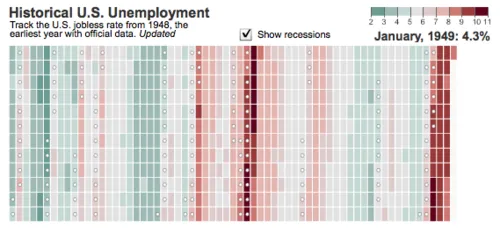
WSJ Unemployment Tracker
The Wall Street Journal posted an interactive heat map to visualize the unemployment rate nationally over time. The backstory from the latest numbers: Under the government’s definitions, people only count as unemployed when...
Read more →
Charting Recessions and Recoveries
Amanda Cox from The New York Times charted the current downturn compared with history: Horizontal axis shows months. Vertical axis shows the ratio of that month’s nonfarm payrolls to the nonfarm...
Read more →
Charting 'Mass Layoffs'
The Bureau of Labor Statistics reported this week that employers in December conducted roughly 1,380 “mass layoffs,” incidents in which more than 50 workers lose their jobs. That happened to about 145,000...
Read more →