Published on , by Matt Stiles, September 17th 2016, 12:50:32 pm
It’s baby season in America, with September the busiest month for births on average in the last two decades. So it seemed like the right time to remix this blog’s most-popular post: How Common is Your Birthday?
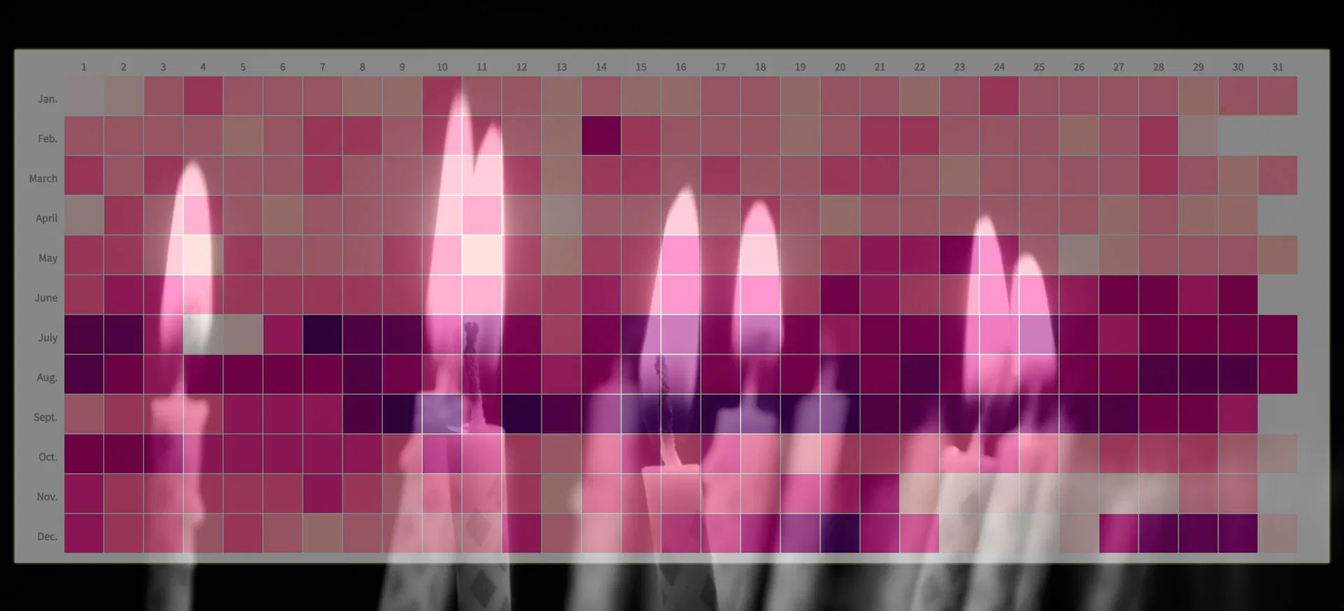
That old heatmap, which highlighted specific dates for popularity, has been viewed more than 500,000 times here and published across the web. But it was flawed, namely that it used ordinal data (birthday ranks by date) rather than continuous data (actual births counts by date). This graphic finally addresses that problem:
This new version of the heatmap, which is interactive on larger screens, uses births by day from 1994 to 2014, thanks for the fine folks at FiveThirtyEight, whose reporters posted the tables on Github for an unrelated project. It lists the average number of births by day, the rank (number one is most common) and an estimated — if slightly irresponsible — conception date.
Some highlights:
You can have a look at the data for yourself in this table:
Chances are you came here looking for the legacy birthday graphic. If you must, find it here, along with a related post about the flawed methodology.
Meanwhile, check out your birthday, share your thoughts in the comments — and tell the Internet to do the same.
Credits: Thanks, Cynthia Brewer, for your wonderful color guide. After trying several of your sample palettes, I couldn’t decide. So my three-year-old daughter — who celebrates a birthday Sept. 22 — chose this one. It looked the most like a birthday cake, she said. Also, thanks to publicdomainpictures.net for the cake image.
Follow me on Twitter @stiles, and keep up with The Daily Viz posts on Facebook.