Census Bureau Releases 1940 Data. America Has Changed.
After 72 years, the U.S. Census Bureau today released data from its decennial count in 1940. The release includes a fascinating graphic about how Americans have changed over time. Here’s just one section, comparing our workforce:
There’s much more in the graphic: housing, demographics, etc. C...
Read more →
Visualizing Gas Prices by State, Income and Time
Gas prices risen for the eighth straight day, part of a trend that’s driven the cost up 17% this year, according to AAA data reported by CNN Money:
The national average price for a gallon of gasoline rose for the eighth straight day on Saturday to $3.835. That is now only about 7% below the re...
Read more →
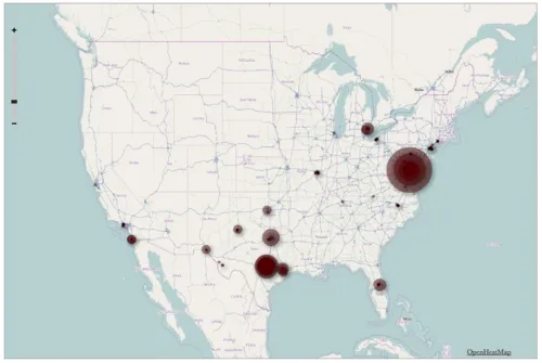
Visualizing Foursquare, Pt. 2
This morning I posted a quick map illustrating my 1,100 check-ins on Foursquare during the last two years. I made it using TillMill, an open-source application for creating interactive map tiles.
This version was made in OpenHeatMap (larger symbols represent more check-ins). Clearly my Foursqua...
Read more →
Visualizing Foursquare
I’m generally obsessed with Foursquare, the location-based service that allows users to broadcast their travels to friends. I’ve checked in more at more than 1,100 places since joining the service in February 2010, apparently more often on weekends:
But not so much in May:
And on three contin...
Read more →
BRB
It’s been tough to keep this blog “daily” with a travel schedule like this over the last 30 days (compiled from Foursquare checkins):
I’ll be back tomorrow with regular updates.
Learn the Foursquare API.
Read more →
Charting Metro Diversity
Interesting news from my favorite Texas city, according to this story the Houston Chronicle:
The Houston region is now the most ethnically diverse large metropolitan area in the country, surpassing New York City.
Two suburbs - Missouri City and Pearland - have become even more diverse than th...
Read more →
Our Warm Januaries
Last month was the fourth-warmest January in the contiguous United States on record, according to the National Oceanic and Atmospheric Administration.
This chart shows three decades of Januaries. Red bars represent the percentage of the country that experienced “very warm” conditions compared t...
Read more →
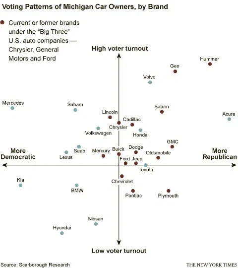
What Car Brands Tell Us About Our Political Participation
Interesting…
When it comes to cars, the results are often predictable. It probably won’t surprise anyone to learn that the data, as collected by Scarborough Research, show that drivers of hybrid automobiles tend to skew Democrat and are highly likely to vote. Subaru owners, as well. Saab and V...
Read more →
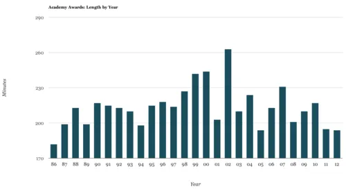
How Did This Year's Oscar Ratings, Length Compare?
This year’s Academy Awards presentation seemed to drag on forever, but it wasn’t actually that long compared to past shows. The event last lasted 194 minutes, which is slightly longer than the average since the mid-1980s (183 minutes), but relatively short compared to the four-hour-plus show in...
Read more →
Mapping with TileMill
I just returned from the NICAR journalism convention in St. Louis, where I helped teach hands-on panels for using TileMill, the open-source mapping application. This first map we made shows the murder rate per 100,000 residents in the nation’s largest cities:
We also mapped the poverty rate: ...
Read more →