Where Do Your State's Freshmen Come From?
The Chronicle of Higher Education last month published an interesting piece about competition among universities for out-of-state students.
Public universities across the country are engaged in an all-out war for out-of-state students. Deep cuts in support are driving the search for revenue, ...
Read more →
Mapping 'Poisoned Places'
NPR and the Center for Public Integrity have teamed up for a series of this stories this week about facilities that emit toxic chemicals. One part of the package is this interactive map, which plots more than 13,000 regulated facilities across the country — and also colors the dots based on the...
Read more →
Best of 'The Daily Viz'
I started this little blog 10 months ago as a place to post my experiments with data visualization. Some posts have flopped, but a few caught fire. Here are the top eight, ordered by popularity:
1. Mapping Where GOP Candidates Raise Their Campaign Donations
2. Mapping London Riots, ‘Deprivati...
Read more →
Plotting 'Multicides'
Bill Marsh and other artists at The New York Times created this timeline of world atrocities over the centuries.
Estimating the tolls from such horrors is an inexact science, given war’s nature and the mysteries of antiquity. The deadliest “multicides” are more plentiful in recent centuries,...
Read more →
Google Search Insights: Occupy Wall Street vs. Tea Party
Google’s politics and elections team compared search trends for the Occupy Wall Street movement and the Tea Party. Here’s what they found:
Searches for Occupy Wall Street started on Sept 16th & peaked one month later on October 15th
NY is tops in searches, right? Wrong. Top 3 states for ...
Read more →
Consumer Spending on Costumes
This map, made by Esri, shows consumer spending on costumes by U.S. zip code:
View larger PDF version
Read more →
Walk-Off Home Run History
Turns out game-ending home runs — like last night’s centerfield shot by St. Louis Cardinals infielder David Freese — are more common than I imagined. There have been nearly 3,000 in the last five decades, including more than 70 this season.
That’s twice the figure from 1960:
View interactive ...
Read more →
Tsunami Debris Coming?
I noticed this animated map — apparently first published in the spring — while watching CNN today. It shows how debris from the Japan tsunami is expected to migrate across the Pacific Ocean to U.S. shores over the next few years:
Year two:
In four years, it could hit Hawaii:
Can’t wait to...
Read more →
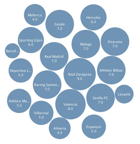
Another View of La Liga Stats
Here’s another look at discipline in the Spanish La Liga soccer league, this time focusing on team-by-team totals.
This bubble chart represents yellow card totals by club:
With Many Eyes, you can toggle the view to show red card stats by team (bubbles are sized based on the proportion of all...
Read more →
Spanish Soccer Discipline
Discipline varies widely in the Spanish first-division soccer league, or La Liga. These stats from last season group yellow cards violations by team and player. Real Zaragoza received 63 yellow cards. Sevilla FC, conversely, received just seven. The two marque teams in the league — Real Madrid ...
Read more →