A Rough Year For RIM
Not a good day today for BlackBerry maker Research In Motion, according to this Bloomberg piece:
Research In Motion Ltd. plunged in extended trading after missing analysts’ estimates as sales of aging BlackBerry smartphone models slowed and the company shipped fewer PlayBook tablet computers ...
Read more →
Comparing National Obesity
I just noticed this cool tool by Alex Perez on Data.gov that maps and charts American obesity by county. His interactive uses proportional symbols and colors to visualizes differences between, with larger bubble and darker reds representing increased obesity rates. Here’s Louisiana:
Selecting...
Read more →
Mapping American Poverty
A national map prompted by today’s news about Americans in poverty:
WASHINGTON — The portion of Americans living in poverty last year rose to the highest level since 1993, the Census Bureau reported Tuesday, fresh evidence that the sluggish economic recovery has done nothing for the country’s...
Read more →
9/11: In A Word
My colleagues at NPR put together this interesting interactive visualizing one-word feelings about 9/11 then and now:
Read more →
sunfoundation: Visualizing the Local Effects of Recovery Spending on Job Loss In the wake of U.S. P
sunfoundation:
Visualizing the Local Effects of Recovery Spending on Job Loss
In the wake of U.S. President Obama’s speech on jobs last night, we present this mapping of Recovery Act spending. Development Seed, the same folks who mapped the famine in the Horn of Africa, have turned their att...
Read more →
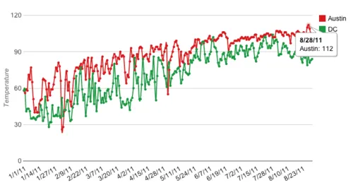
DC vs. Austin Weather: Part 2
Back in May I compared the weather in my former town, Austin, Texas, to my current home, Washington, DC. Now that I’ve lived through a summer here, I’ve revisited the topic with two simple line charts.
This first chart shows monthly averages. As you can see, Austin experienced 100-degree averag...
Read more →
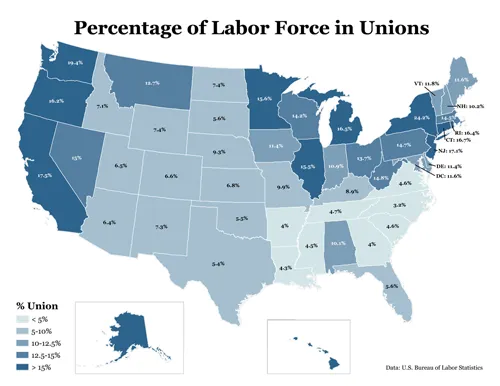
Union Membership by State
In the early 1970s, one in four American workers belong to a labor union. Last year, they represented about 12 percent of the workforce, according to the Bureau of Labor Statistics.
This map shows membership by state, with darker shades representing higher proportions of the workforce in union...
Read more →
It's Easy to Draw Your Own Google Correlations
I’m a big fan of Google Correlate, a service that lets you spot real-word trends through Internet users’ searches. For example, search traffic for the term “lose weight” spikes around New Year’s Day:
A friend this morning told me about a new feature allowing anyone to draw random distribution...
Read more →
futurejournalismproject: shortformblog: azspot: Comparing Recessions and Recoveries: Job Changes Per
[caption id="attachment_141" align="alignnone" width="495" caption="futurejournalismproject: shortformblog: azspot: Comparing Recessions and Recoveries: Job Changes Per"][/caption]
Read more →
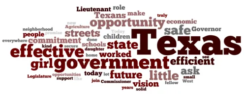
Analyzing Two Rick Perry Speeches: 1998 vs. 2011
I stumbled upon Texas Gov. Rick Perry’s announcement speech from his 1998 race for lieutenant governor, arguably my former state’s most powerful political job. Back then, his candidacy centered on “safe streets, effective schools, and economic opportunity.”
Here are the top 50 most used words i...
Read more →