Rick Perry: Fundraiser
Now that Texas Gov. Rick Perry, R-Texas, is officially in the presidential race, reporters are noting his campaign fundraising prowess as a possible strength that could propel him to the GOP nomination:
But it is a credential Mr. Perry is unlikely to highlight that could make him the most for...
Read more →
Mapping London Riots, 'Deprivation'
This interactive map, made with Google Fusion Tables, shows recent riot locations in greater London as red points. The colors represent “indices of deprivation” by “lower super output areas,” which appear similar to blocks or tracts in the U.S. Census. Deeper reds represent higher poverty, whil...
Read more →
Mapping Oil/Gas Drilling in PA
Scott Detrow and I mapped drilling for NPR’s StateImpactPA site:
First, while 32 counties host gas wells, the bulk of activity is still taking place in a handful of drilling-heavy counties. More than 60 percent of the 739 wells drilled between January and June were located in the five busiest ...
Read more →
Premier League Stats
From Tableau Public’s “most commented viz of the week”:
Robert Mundigl created this amazing multi-faceted look into the English Premier League over the past 15 years or so. The analysis is complex but easily displayed, take a look for yourself.
Read more →
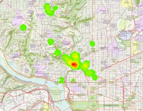
Mapping D.C. Embassies
You may have heard the term Embassy Row, which refers to the cluster of international diplomatic headquarters along Massachusetts Avenue in northwest D.C.
This map shows all 178 embassies, from Afghanistan to Laos to Zimbabwe, as points on a topographic map:
Here’s the same view, but as a poi...
Read more →
azspot: Tax Burdens Around the World
[caption id="attachment_174" align="alignnone" width="463" caption="azspot: Tax Burdens Around the World"][/caption]
Read more →
Sizing Up Big Cities
A colleague recently asked how Houston, which is about 600 square miles, compared to Detroit in land area. The answer: It’s much larger. Here’s a map of other major cities, with proportional symbols representing square miles:
Read more →
columnfive: Big Mac-ronomics: What the price of a Big Mac reveals about purchasing power around the
[caption id="attachment_178" align="alignnone" width="620" caption="columnfive: Big Mac-ronomics: What the price of a Big Mac reveals about purchasing power around the "][/caption]
Read more →
Park Land Per Person
Via Per Square Mile:
See larger version
Read more →
futurejournalismproject: Programming Language Popularity as of May 2011 Detail from the Evolution of
[caption id="attachment_182" align="alignnone" width="620" caption="futurejournalismproject: Programming Language Popularity as of May 2011 Detail from the Evolution of"][/caption]
Read more →