Visualizing Congress
I just discovered the promising Clear Congress Project today, which visualizes legislative data by political party and other other variables in real time. A mission statement from the developer:
With the expansion of the Internet and computing technologies, the amount of data generated and r...
Read more →
The GOP Bubble
Nate Silver plots the GOP presidential field:
I’ve sometimes taken a visual approach toward the Republican field, where the positions of the candidates are plotted out based on whether they are perceived to be conservatives or moderates, and insiders (establishment candidates) or outsiders (in...
Read more →
Women in Congress
Via fishnette:
Here’s a little Google Fusion chart i did for a Politics Daily story last summer and just updated:
Clearly, i have some logistics to clean up here to fit such things on this tumblr. Suggestions are welcome! Gotta ride my bike tho… more later!
Read more →
U.S. Average Annual Precipitation
Now happily living on the green(er) side.
From mocus:
Those of us who live west of the Cascade mountain range are not strangers to wet weather. While the Northwest as a whole gets a bum rap for being excessively rainy and dreary, the description is apt for the land between the Pacific coas...
Read more →
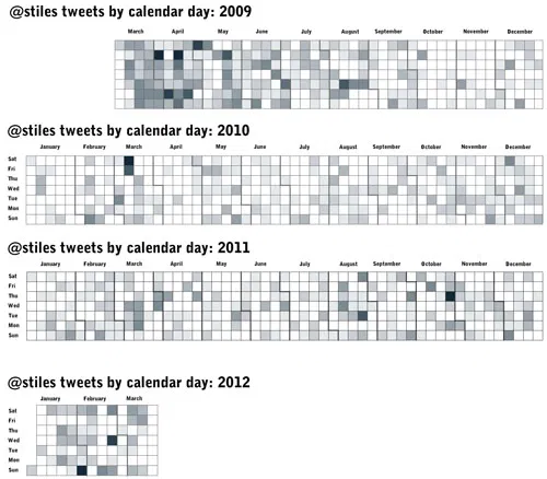
Visualize Your Tweets with Proportional Symbols
This app, Tweet Topic Explorer, creates proportional symbols based on the frequency with which you use specific words. Here are my tweets since early April. This isn’t a surprise, I guess:
H/T: Becca Aaronson
Read more →
theeconomist: Daily chart: two thousand years in one chart. Measured in years lived, the present cen
theeconomist:
Daily chart: two thousand years in one chart. Measured in years lived, the present century, which is only ten-years old, is already “longer” than the whole of the 17th century. That is a lot of history for a single decade.
Read more →
How I Lost My (Former) Congressman
Ryan Murphy at The Texas Tribune created this awesome mapping feature that allows users to search their addresses to see how their representation in the U.S. House may have changed during redistricting.
Before: Our house in south Austin was represented by U.S. Rep. Lloyd Doggett, a Democrat:
...
Read more →
Mapping the New York Senate Same-Sex Marriage Vote
As we all know, the New York Senate on Friday voted to approve same-sex marriages. These maps, made with ArcGIS, visualize the districts by vote, seniority and political party. First, the vote:
And seniority by years:
And, finally, political party:
Here’s an interactive version of the vot...
Read more →
Heat vs. Mavericks
A nifty interactive (that I only now discovered) via The Washington Post:
Finally we saw the soul-crushing, double-digit defeat we’d expected, although not by the all-star-laden Heat. After coming back to win at the ends three of the first five Finals games, the Mavericks tried something new:...
Read more →
U.S. Open Venues
The U.S. Open golf championship has been held at 50 of the nation’s elite courses since it began in 1895, including this week at Congressional Country Club in Maryland. But those courses are in only 17 states.
This map shows the frequency, by state, using proportional symbols:
New York and Pe...
Read more →