Mapping D.C. Schools
UMBC professor Lou Paladino made this interesting map that visualizes academic performance by Washington, D.C., school districts. Darker cool colors represent higher scores; darker warm colors represent lower scores. This shows that the separation of population in D.C. by race, poverty and crim...
Read more →
World Internet Stats
The U.S. is among the most wired countries in the world, with three out of every four Americans having access to the Internet, according to these stats. Only Japan, Germany and the United Kingdom have higher rates of Internet use.
This charts shows the top 25 most populous countries in the wor...
Read more →
California Redistricting with Google Fusion Tables
This redistricting map app is among the best Google Fusion Tables examples I’ve seen in media. It draws proposed legislative boundaries but also has a nifty search function. Here’s the before/after view of congressional districts statewide:
Before/after Compton:
Before/after San Diego:
Befor...
Read more →
Comparing Lebron's Career vs. 2011 Finals Performance
One of the key story lines in this year’s NBA finals has been the play of Miami Heat superstar Lebron James, whose sluggish performance has fans and reporters scratching their heads.
This interactive bubble chart compares James’ per-game statistics by career, playoffs and this year’s finals. C...
Read more →
Mapping Unemployment Change by U.S. Counties
Nationally, the unemployment rate fell less than one percentage point from April 2010 to April 2011. But not all areas of the country are the same.
This map, made with ArcGIS, shows all 3,100 U.S. counties, with darker green shades representing counties that saw their unemployment rates decreas...
Read more →
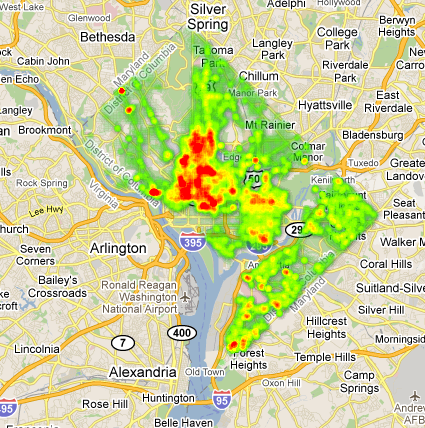
D.C. Crime Heat Map
Yesterday I posted some thematic maps showing D.C. population and crime by political ward. Here’s that same 2008-10 crime data — more than 100,000 murders, robberies, burglaries, thefts and other major crimes — in a heat map:
View larger, interactive map | Download data
Read more →
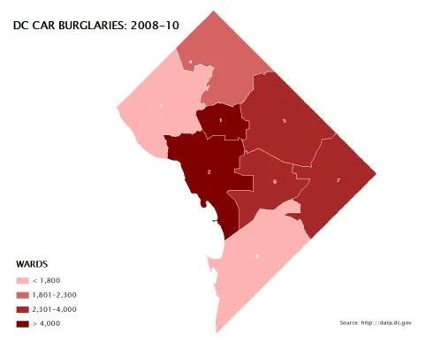
D.C. Population, Crime by Political Wards
I’ve posted before about crime in Washington, D.C., a city I’m still working to understand demographically and geographically. Here are some maps I made this morning as part of that process.
First, here’s a look at population* by political ward (I live in Ward 5). Darker shades represent more r...
Read more →
America's 'Youngest' Counties
In recent weeks the U.S. Census Bureau released more detailed demographic profiles obtained during the 2010 count. Unlike redistricting data, which was released earlier this spring, the demographic profiles break out the population by specific age categories.
This map shows more than 3,100 U.S....
Read more →
futurejournalismproject: Partners in Crime The real estate search engine Trulia teamed up with Crime
[caption id="attachment_213" align="alignnone" width="620" caption="futurejournalismproject: Partners in Crime The real estate search engine Trulia teamed up with Crime"][/caption]
Read more →