Five Years of Facebook Posts
I joined Facebook nearly five years ago, and I’ve since posted more than 1,700 items to my wall, a figure I obtained by downloading my profile history. I wondered what all these status messages, news stories, cat pictures, videos and other musings would look like in a word cloud (excluding comm...
Read more →
World Monarchies
A cool interactive map from NPR (even though it uses Flash):
Read more →
More Texas Redistricting
At work, I used the jQuery Before/After plugin in to visualize redistricting, this time focusing on new Texas Senate maps released on Wednesday.
Read more →
Mapping Starbucks Locations
I stumbled upon this interactive, which visualizes the locations of more than 18,000 international Starbucks locations using Google Fusion Tables and custom JavaScript. Here’s the USA view:
Europe and Asia:
And Washington, DC. Notice the lack of locations in my ‘hood, Brookland, which is rep...
Read more →
Charting Twitter Stats
One hundred is the new 140 on Twitter, according to my wife. How am I doing? My tweets since August 2009:
Tweets: 1523. Average tweet: 89 characters.
Longest tweet:
RT @KenLegler: MERRYº°¨¨°º¤ø °¨¨°º¤ø ¸„ø¤º°¨¨°º¤ø¸CHRISTMAS¤ø ¸„ø¤º°¨¨°º¤ø ø¤º°...
Read more →
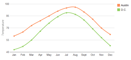
DC vs. Austin Weather
I love Austin, but my biggest complaint about Texas’ capitol city is the oppressive summer heat. And when I say summer, I mean April to October. Today’s high temperature is forecast to be 98 degrees, for example.
A pleasant surprise in my new city, Washington, D.C., is that I’m actually experi...
Read more →
English Premier League Wins, Goals
Today’s match between Manchester United and Chelsea could well decide who wins the English Premier League title this season. Of course, both teams are comfortable in this position, having dominated the league in the last two decades along with two other elite clubs: Arsenal and Liverpool.
This ...
Read more →
Visualizing Geo Data on a Globe
From the Google Code blog:
Today we’re sharing a new Chrome Experiment called the WebGL Globe. It’s a simple, open visualization platform for geographic data that runs in WebGL-enabled browsers like Google Chrome. The globe below shows world population, and we’ve created another globe showing ...
Read more →
White House Maps 'Excess Properties'
The White House today released an interactive map of excess properties maintained by the federal government. And, even better, it appears they made it with open-source tools. An explainer:
The Federal Government is the biggest property owner in the United States, and billions of taxpayer doll...
Read more →
Mapping Redistricting with jQuery Before/After
Today’s viz from work uses the jQuery Before/After plugin to create sliders over static Texas House redistricting maps to visualize changes:
The Texas House approved new political maps last week as part of decennial redistricting. In many cases, the newly drawn state House districts changed bo...
Read more →