Analyzing Twitter Followers
Using Export.ly, I downloaded a detailed spreadsheet of all my Twitter followers. This word cloud shows the most common words in their bios:
Source: Wordle
Read more →
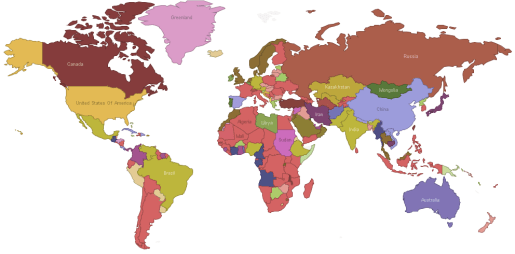
How the World is Governed
This interactive map, created by Many Eyes user Vortextual, categorizes government regime types by country, according to the CIA World Factbook:
Source: Download Data
Read more →
On the Records: Visualizing Today's Speeches
On the Records: Visualizing Today's Speeches
Read more →
'Map-of-a-tweet'
This is an oldie, but a goodie: A color-coded chart that helps decipher the Twitter API, created by the company’s platform services lead, Raffi Krikorian. Each color represents a different field of data created each time you tweet. All this data is available to developers to build cool stuff lik...
Read more →
Mapping 'My' Austin
Using a nifty tool created by programmer Steven Lehrburger, I made this heat map to represent my last 300 check-ins to Foursquare, the location-based service. Here’s where I go:
(Hat tip: Zachary M. Seward)
Read more →
Pomp, Circumstance — and Consequences
Pomp, Circumstance — and Consequences
Read more →
Weekly Church Attendance
These maps show the percentage of adults in each state who said they attended church each week (or almost each week) in 2009:
Click the image below for an interactive version, which categorizes states in quintiles by rank (1-10, 11-20, etc., so the colors don’t match perfectly to the above ma...
Read more →
Pomp, Circumstance — and Consequences
Pomp, Circumstance — and Consequences
Read more →
Charting Home Improvement
I spent the morning replacing old door knobs and power outlets around the house. These items were purchased from both Lowe’s and Home Depot — America’s two retail home improvement giants. The stores in our neighborhood are next to one another, and I sometimes can’t decide which one to choose.
P...
Read more →
Diverging Views of America
Ronald Brownstein writes today about the “daunting and even historic” rejection of Democrats by white voters in last year’s mid-term elections. The story also links to this cool graphic, which illustrates the divide between whites and non-whites, according to their answers in exit polls:
Grap...
Read more →