Posts tagged "BLS"

Visualizing the Historical Relationship Between White, Black Unemployment Rates
President Trump was right last month when he bragged that black unemployment rate was at a historical low. The rate in December was 6.8 percent, the lowest it's been since...
Read more →
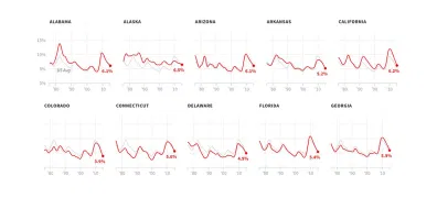
Four Decades of State Unemployment Rates, in Small Multiples, Part 2
I posted recently about how the state-by-state unemployment rate has changed during my lifetime. The result was a small multiples grid that put the states in context with one another....
Read more →
Four Decades of State Unemployment Rates, in Small Multiples
There's good news this week in the monthly jobs report, the latest sign that the economy, however grudgingly, has healed from the financial crisis nine years ago: The unemployment rate...
Read more →
How Americans Spending Habits Compare With Other Countries
From The Washington Post: The Bureau of Labor Statistics has a fascinating new report out that compares consumer budgets in the United States, Canada, Britain and Japan. As the graph...
Read more →
Charting 'Mass Layoffs'
The Bureau of Labor Statistics reported this week that employers in December conducted roughly 1,380 “mass layoffs,” incidents in which more than 50 workers lose their jobs. That happened to about 145,000...
Read more →