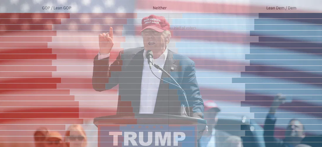
Visualizing Historical Political Party Identification in the Era of Trump

By Matt Stiles | | Topics: Policy & Politics

As many have noted, President Trump has shown a remarkable ability to maintain a strong base of support — about 40% of the voters — despite the myriad controversies swirling around him.

Some clues about that base can be seen in the results of a fascinating survey taken recently by Pew Research Center to gauge Americans’ reaction to the Mueller investigation.

Deep in the white paper released by Pew are historical numbers listing the percentages of Americans who either support one of the two major parties or consider themselves independents, many of whom admit leaning left or right . These data probably aren’t news to people who follow politics more closely than I do, but the broad trends they illustrate were interesting to me — especially when analyzed visually.

First, the data show how support for these groups has changed over time. The reds in the normalized stacked bar chart below represent people who identify with Republicans, or lean towards them, and people who identify with Democrats, or lean toward them. The middle represents a smaller group that supports some other party or doesn’t have strong opinions. I’m calling them “rest”. These are the folks, I suppose, who help decide elections — if they vote.

Neither of the two major parties have maintained a majority of support, but the Democrats were there briefly during the election of Barack Omama and have come closer than the Republicans during the Trump era. You can see bursts of support for the GOP after former President Bill Clinton’s election, when the Republicans took back the U.S. House of Representatives, and in the years following the September 11 terror attacks.

This line chart plots the same groups from a different perspective, perhaps making it easier to see the changes to core party support and the broader strength with some independents leaning their way. You can see the positive swings for Democrats during the early days of the Clinton and Obama eras, and also how GOP support fell during the George W. Bush presidency.

Identification with the presidential party during Clinton, Bush and Obama either dropped or remained flat after they took office. Under Trump, however, the people who identify as Republican (and their learners) have rallied to their embattled president.

This small illustration helps explain the president’s resilient approval numbers. I’ll leave it to others to explain why those supporters remain.

You can download the data from Pew Research Center here.

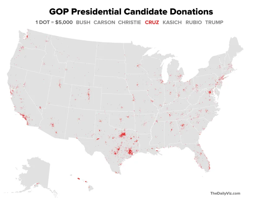
Mapping GOP Campaign Cash by Density

By Matt Stiles | | Topics: Policy & Politics

The GOP presidential candidates collectively have raised more than $300 million in this election cycle, according to Federal Election Commission data. Here’s a quick look at where several of those candidates — Jeb Bush, Ben Carson, Chris Christie, Ted Cruz, John Kasich, Marco Rubio and Donald Trump — collected the money.

Each dot on the maps (see update below) below represents at least $5,000 raised by zip code. The dots in each place are assigned randomly within the zip code boundaries, creating a density map (think Verizon vs. AT&T) for campaign donations* through Feb. 29.

Here’s a (crowded) map with all the candidates. The dots were layered alphabetically, a method that unfortunately obscures some candidates at this scale, depending on the geography. Still regional differences are evident:

zips_gop_contribs_all

JEB BUSH

The former Florida governor raised large amounts of money, of course, from his home state, but also — as the perceived frontrunner for a time — from major population centers:

zips_gop_contribs_bush_red

BEN CARSON

Carson raised a ton of money for someone who received relatively little love once voters started casting their ballots. His map shows he raised more from small locations throughout the country, not just the major population centers:

zips_gop_contribs_carson_red

CHRIS CHRISTIE

The New Jersey governor, understandably, raised a large proportion of his money from his home region:

zips_gop_contribs_christie_red

TED CRUZ

The Texas senator raised money from all over the country, but he clearly has a financial base in Dallas-Fort Worth, Austin, San Antonio and Houston — the major population centers in his home state.

zips_gop_contribs_cruz_red

JOHN KASICH

Like Christie, the Ohio governor tapped his donor base at home:

zips_gop_contribs_kasich_red

MARCO RUBIO

The Florida senator’s map looks much like that of his frenemy, Bush:

zips_gop_contribs_rubio_red

DONALD TRUMP

The billionaire business man, who has relied largely on personal funds for his campaign, has raised very little money in checks larger than $200, as reflected in his map:

zips_gop_contribs_trump_red

* To keep the analysis consistent for all campaigns, the maps were created with a data set that excluded individual donations of less than $200. The data include only donations to the candidates’ campaign committees, not other political committees supporting them.

UPDATE (9:20 p.m. EST): Based on David’s suggestion in the comments, I’ve changed the dot color in the individual maps so it’s consistent. You can see the originals here: Bush | Carson | Christie | Cruz | Kasich | Rubio | Trump.

The Nation’s Most Consistently Partisan Counties In Presidential Elections

By Matt Stiles | | Topics: Policy & Politics

When it comes to recent presidential elections, geography — at least in some stubborn places — is destiny.

Voters in more than 1,600 American counties — a little more than half of those* in the United States — have consistently selected the same political party in each presidential election since George H.W. Bush faced off against Michael Dukakis. Chances are many of them will do so again this election cycle, too.

This first map shows each of the counties. They represent a wide swath of American geography — large and small, densely and sparsely populated, rural and urban. The colors show the familiar red/blue categorization of Republicans and Democrats, with darker shades representing a higher respective vote share on average.

seven_counties

About 1,330 of the counties have voted each cycle for the Republican nominee. They are generally less populous, with some exceptions, and clustered across the country in large patches that are obviously familiar to the GOP:

seven_counties_rep

The Democrats have far fewer consistently partisan counties — around 315 — but theirs are somewhat more populous and urban, and they have higher concentrations of minority voters. Again, that’s comfortable turf for Democrats:

seven_counties_dem

Given the differences between the two parties’ counties, plotting them on a map isn’t necessarily the best way to view this data. That’s because the larger, less-populous red counties in the West tend to disproportionally shade the national picture. Conversely, the blue counties tend to be smaller and more densely populated and therefore don’t get fair shake visually.

Another way to look at the data is with a tree map. In the examples below, counties are proportionally drawn in squares and rectangles and clustered by state. Both are then sized based on their respective average vote totals over the seven elections. The colors and sizes at the county level reflect the political party its voters favor — and the average votes per cycle for that party. The result is a clearer picture of each party’s pool of support.

Here’s a version with both parties (see a larger, interactive version here). Notice that the blue area for Democrats is a bit more representative than on the geographic map:

treemap_both

Here’s the Democratic map, which includes many fewer (but more populous) counties and plenty of votes:

treemap_d

The Republicans have a few populous counties, too, but many of them are tiny, as represented on this map:

treemap_r

Again, check out the larger interactive version to filter the maps, see partisan vote averages by county, and even toggle between individual state maps.

Though counties are generally a useless level of geography for presidential elections, it’s still fun to look at which areas inside states are consistently shaping partisan destiny.

* Counties in Alaska and Hawaii not included because Alaska has wacky county problems across elections. Also because of laziness.

Mapping Consistently Partisan Counties

By Matt Stiles | | Topics: Policy & Politics

When it comes to recent presidential elections, geography — at least in some stubborn places — is destiny.

Voters in more than 1,600 American counties — a little more than half of those* in the United States — have consistently selected the same political party in each presidential election since George H.W. Bush faced off against Michael Dukakis. Chances are many of them will do so again this election cycle, too.

This first map shows each of the counties. They represent a wide swath of American geography — large and small, densely and sparsely populated, rural and urban. The colors show the familiar red/blue categorization of Republicans and Democrats, with darker shades representing a higher respective vote share on average.

seven_counties

About 1,330 of the counties have voted each cycle for the Republican nominee. They are generally less populous, with some exceptions, and clustered across the country in large patches that are obviously familiar to the GOP:

seven_counties_rep

The Democrats have far fewer consistently partisan counties — around 315 — but theirs are somewhat more populous and urban, and they have higher concentrations of minority voters. Again, that’s comfortable turf for Democrats:

seven_counties_dem

Given the differences between the two parties’ counties, plotting them on a map isn’t necessarily the best way to view this data. That’s because the larger, less-populous red counties in the West tend to disproportionally shade the national picture. Conversely, the blue counties tend to be smaller and more densely populated and therefore don’t get fair shake visually.

Another way to look at the data is with a tree map. In the examples below, counties are proportionally drawn in squares and rectangles and clustered by state. Both are then sized based on their respective average vote totals over the seven elections. The colors and sizes at the county level reflect the political party its voters favor — and the average votes per cycle for that party. The result is a clearer picture of each party’s pool of support.

Here’s a version with both parties (see a larger, interactive version here). Notice that the blue area for Democrats is a bit more representative than on the geographic map:

treemap_both

Here’s the Democratic map, which includes many fewer (but more populous) counties and plenty of votes:

treemap_d

The Republicans have a few populous counties, too, but many of them are tiny, as represented on this map:

treemap_r

Again, check out the larger interactive version to filter the maps, see partisan vote averages by county, and even toggle between individual state maps.

Though counties are generally a useless level of geography for presidential elections, it’s still fun to look at which areas inside states are consistently shaping partisan destiny.

* Counties in Alaska and Hawaii not included because Alaska has wacky county problems across elections. Also because of laziness.