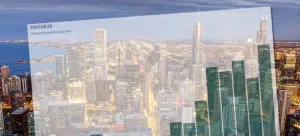
Visualizing the News Nerd Conference Known as #NICAR18

By Matt Stiles | | Topics: Uncategorized

I’m in the United States this week to attend the annual news nerd conference known as NICAR, a diverse gathering of reporters, editors and developers (and others) focused on storytelling with data.

I look forward to it like Christmas.

I get to return to the United States, see old friends, learn new skills and drink Diet Coke, which is nearly impossible to find in South Korea, where I work as a foreign correspondent for the Los Angeles Times.

These basic graphics help explain the event, held this year in Chicago.

First, there’s record-breaking attendance* this year:

The event has more than 200 sessions over five days, from the basic use of spreadsheets in news gathering to the construction of complex news applications — and the organizers (who graciously share data about the conference) categorized them by type:

The conference generally has a mix of skills sets and expertise levels, which is evident in the session categories:

There are people here from almost every American state and from numerous countries around the world. My jet lag brain is still working through how to best visualize that, perhaps in a map. I’ll post something soon.

Image courtesy Allen McGregor via Wikipedia Commons.