Posts tagged "counties"
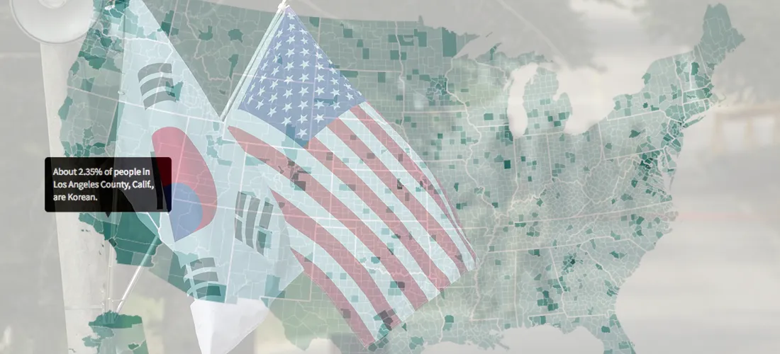
Mapping the United States' Korean Population
I've often felt fortunate that I get to write about South Korea for the Los Angeles Times, a newspaper that's still interested in stories related to life, politics and culture...
Read more →

The Nation's Most Consistently Partisan Counties In Presidential Elections
When it comes to recent presidential elections, geography — at least in some stubborn places — is destiny. Voters in more than 1,600 American counties — a little more than half of...
Read more →
Mapping Consistently Partisan Counties
When it comes to recent presidential elections, geography — at least in some stubborn places — is destiny. Voters in more than 1,600 American counties — a little more than half of...
Read more →
Where 'Anglos' are the Minority
I've posted before about "majority minority" counties — places where non-Hispanic whites represent less than half the population. They were critical to President Obama's election in 2008, and their numbers...
Read more →