Posts tagged "Google Fusion Tables"
Mapping VP Birthplaces
If elected, Republican Paul Ryan would be the first vice president from Wisconsin. Here's where the 47 men who've held the office were born, according to data on Wikipedia: Download...
Read more →
BRB
It’s been tough to keep this blog “daily” with a travel schedule like this over the last 30 days (compiled from Foursquare checkins): I’ll be back tomorrow with regular updates. ...
Read more →
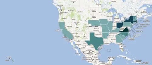
Mapping the Birthplaces of U.S. Presidents
Since I get the day off, I figured I should repay our presidents by honoring their birthplaces with two maps made with Google Fusion Tables. This first map places points...
Read more →
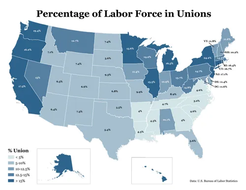
Union Membership by State
In the early 1970s, one in four American workers belong to a labor union. Last year, they represented about 12 percent of the workforce, according to the Bureau of Labor...
Read more →
Florida Teacher Pay
A map for our NPR project, StateImpact: This map visualizes how much the average teacher’s salary has changed since the 2007-08 school year. Darker reds represent deeper pay cuts, while...
Read more →
USA Soccer Players Overseas
Dozens of American soccer players are members of international clubs, especially in Europe. Germany’s Bundesliga and England’s Premiere League have the the most: 15 each. Download data | Source: Yanks-Abroad.com...
Read more →
Mapping London Riots, 'Deprivation'
This interactive map, made with Google Fusion Tables, shows recent riot locations in greater London as red points. The colors represent “indices of deprivation” by “lower super output areas,” which appear...
Read more →
Drug Deaths In England
From the Guardian’s Data Blog: The death of Amy Winehouse, widely reported as due to a suspected drug overdose, has drawn attention to drug misuse across the country. How bad...
Read more →
Mapping D.C. Schools
UMBC professor Lou Paladino made this interesting map that visualizes academic performance by Washington, D.C., school districts. Darker cool colors represent higher scores; darker warm colors represent lower scores. This...
Read more →
World Internet Stats
The U.S. is among the most wired countries in the world, with three out of every four Americans having access to the Internet, according to these stats. Only Japan, Germany...
Read more →
California Redistricting with Google Fusion Tables
This redistricting map app is among the best Google Fusion Tables examples I’ve seen in media. It draws proposed legislative boundaries but also has a nifty search function. Here’s the before/after view of...
Read more →
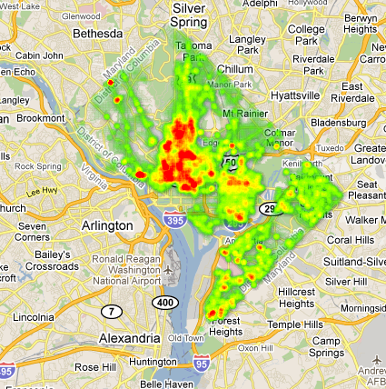
D.C. Crime Heat Map
Yesterday I posted some thematic maps showing D.C. population and crime by political ward. Here’s that same 2008-10 crime data — more than 100,000 murders, robberies, burglaries, thefts and other...
Read more →
In the Suburbs, I...
… should be buying gas, according to this map of D.C.-area gas prices. The lowest, in Maryland, are about $3.70 per gallon of regular gas. (The D.C. average is more...
Read more →
Top-Tier Soccer League Attendance by Country
Germans like their fussball, apparently. The country has the highest average attendance to association football matches in the world — better even than England, where the rules for what we...
Read more →
Mapping Starbucks Locations
I stumbled upon this interactive, which visualizes the locations of more than 18,000 international Starbucks locations using Google Fusion Tables and custom JavaScript. Here’s the USA view: Europe and Asia: And...
Read more →
Mapping Yesterday's Tornadoes
The National Weather Service has tons of free data available online, including a daily list of tornadoes. Here’s a map of yesterday’s 164 events, which occurred in 14 states. That’s almost...
Read more →
U.S. Naturalizations by Country
The Department of Homeland Security now posts records detailing how many people become U.S. citizens each year, and from which countries. Visualizing this data on a world map is easy,...
Read more →