Posts tagged "netherlands"
Are People in Colder Countries Taller? (Continued...)
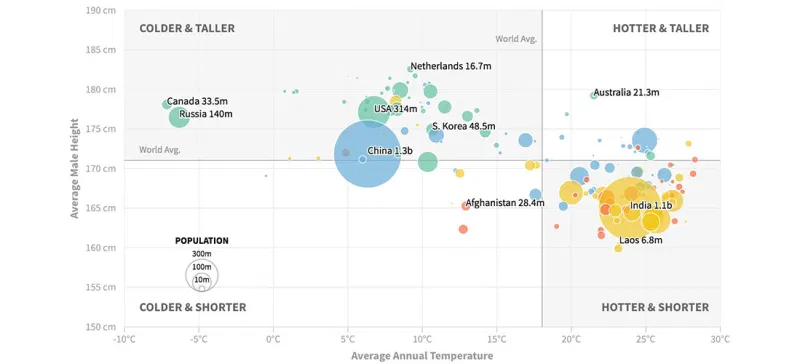
Earlier this week I posted two scatterplots examining the relationship between a country's average temperature and its male residents' average height. The data show some correlation, but there probably are...
Read more →
Are People in Colder Countries Taller?
I got married in Amsterdam. One thing I remember most about my time in The Netherlands is the obvious height of the locals. Both men and women, generally, are quite...
Read more →