Posts tagged "Proportional Symbols"
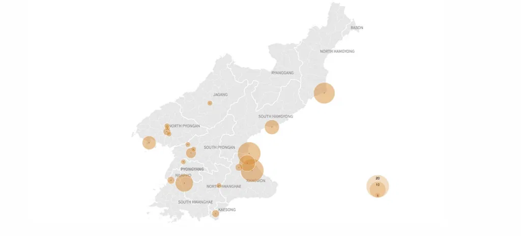
Visualizing North Korea's Missile Launches
Despite international objections, North Korea has launched four ballistic missiles in the last week, including one that flew over Japan, raising regional tensions about the rogue state's weapons development even...
Read more →
Plotting 'Multicides'
Bill Marsh and other artists at The New York Times created this timeline of world atrocities over the centuries. Estimating the tolls from such horrors is an inexact science,...
Read more →
Mapping ONA Attendees
More than 1,000 people were on the attendee list for last weekend’s Online News Association convention in Boston, according to a list the organizers graciously released. The data weren’t perfect. Only...
Read more →
Comparing National Obesity
I just noticed this cool tool by Alex Perez on Data.gov that maps and charts American obesity by county. His interactive uses proportional symbols and colors to visualizes differences between,...
Read more →
Sizing Up Big Cities
A colleague recently asked how Houston, which is about 600 square miles, compared to Detroit in land area. The answer: It’s much larger. Here’s a map of other major cities,...
Read more →
Park Land Per Person
Via Per Square Mile:
See larger version
Read more →