Posts tagged "Scatter Plot"
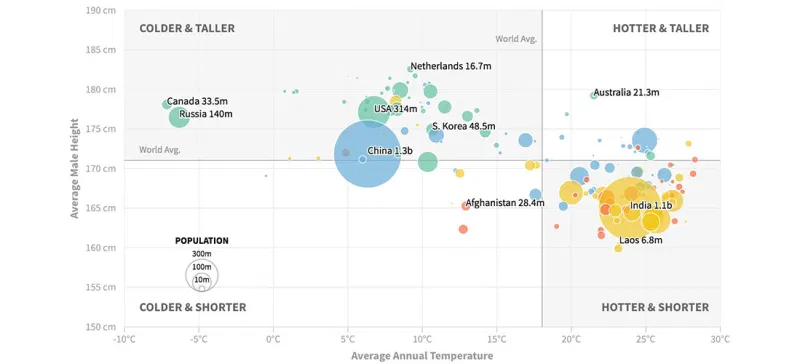
Are People in Colder Countries Taller? (Continued...)
Earlier this week I posted two scatterplots examining the relationship between a country's average temperature and its male residents' average height. The data show some correlation, but there probably are...
Read more →
Are People in Colder Countries Taller?
I got married in Amsterdam. One thing I remember most about my time in The Netherlands is the obvious height of the locals. Both men and women, generally, are quite...
Read more →
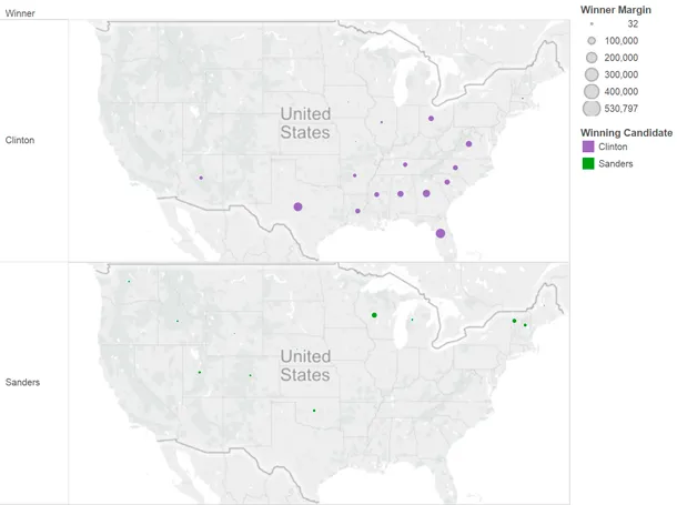
Charting Clinton's Sizable Lead in Votes
This post has been updated. See correction at the bottom of the page. To some Bernie Sanders supporters, the Democratic presidential race must seem close. Their candidate, after all, has...
Read more →
Charting Obama's Path
While in Europe I missed this excellent interactive graphic by Alicia Parlapiano and Amanda Cox of The New York Times. It plots 2008 presidential election results by state with adult residents’...
Read more →
Comparing National Obesity
I just noticed this cool tool by Alex Perez on Data.gov that maps and charts American obesity by county. His interactive uses proportional symbols and colors to visualizes differences between,...
Read more →
Visualizing 2010 Movie Sales
This scatter plot shows how major Hollywood movies performed in 2010. The x-axis, from left to right, shows more money spent to make each movie. The y-axis, from bottom to...
Read more →
Visualizing Congress
I just discovered the promising Clear Congress Project today, which visualizes legislative data by political party and other other variables in real time. A mission statement from the developer: With the...
Read more →
World Internet Stats
The U.S. is among the most wired countries in the world, with three out of every four Americans having access to the Internet, according to these stats. Only Japan, Germany...
Read more →
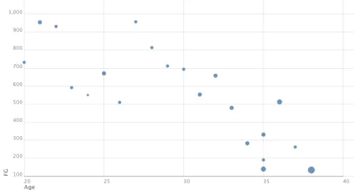
Shaq's Career Stats
Shaquille O’Neal is ending his 19-year NBA career, according to his Twitter feed: Shaq ooout. #ShaqRetires http://www.tout.com/9944wo This scatterplot shows how the 7-foot-1 star’s field goal performance has declined over...
Read more →