Posts tagged "The New York Times"
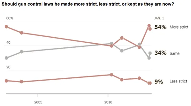
Charting Views On Gun Control
The latest New York Times/CBS News poll shows support among Americans for stricter gun control laws: The massacre of children at an elementary school in Newtown, Conn., appears to be...
Read more →
Analyzing Convention Speeches
The New York Times created two nifty interactive bubble charts to represent the frequency of words used at the respective political conventions. First, the Republicans: And the Democrats (so far):...
Read more →
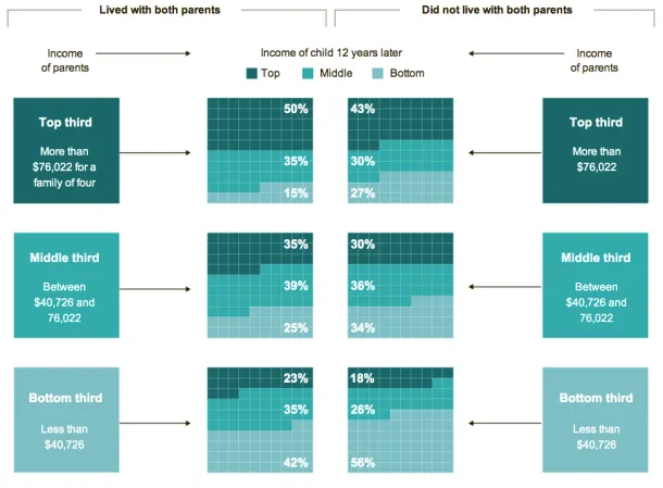
Charting Unmarried Households And The Effect On Kids' Future Income
The New York Times has a fascinating story today about links between marriage and children and the growing class divide in America. The story focuses on two families — one led...
Read more →
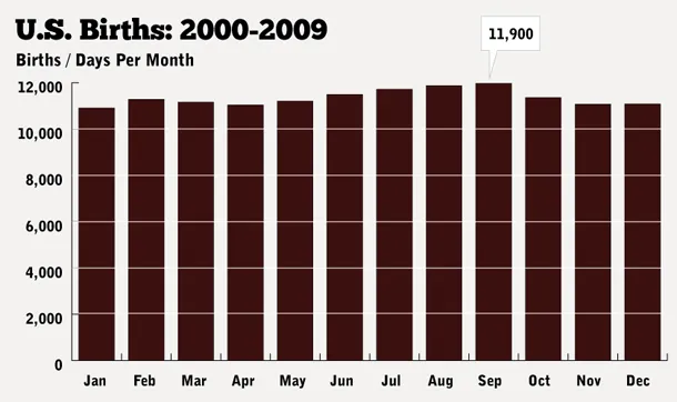
How Common Is Your Birthday?
UPDATE: I've written a clarification about this post here. Please read it. A friend posted an interesting data table on my Facebook wall yesterday, which was my birthday. The data...
Read more →
Charting Post Offices
The U.S. Postal Service is still struggling to compete in an era of declining paper mail, and as private industry and Congress have resisted its efforts to reform, according to...
Read more →
NY Times Examines Injuries To Jockeys, Horses At Race Tracks
The New York Times has posted a sad and troubling story about the horse racing industry: [A]n investigation by The New York Times has found that industry practices continue to put...
Read more →
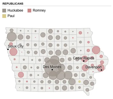
2008 Iowa Caucus Results
These maps, created by The New York Times four years ago to visualize the Republican results, might be interesting for reference as the returns come in tonight. Mitt Romney, who lost...
Read more →
Charting Obama's Path
While in Europe I missed this excellent interactive graphic by Alicia Parlapiano and Amanda Cox of The New York Times. It plots 2008 presidential election results by state with adult residents’...
Read more →
Obama's Budget
I’m a big fan of tree maps, especially when they don’t require browser plug-ins. This chart on nytimes.com visualizes President Obama’s budget plan by breaking it into categories. It appears...
Read more →