Mapping Violent Crime, Murder Rates with FBI Data
The FBI today released its mid-year crime figures from large cities around the county, and the data are positive, NPR reports:
The number of violent crimes reported by 12,500 U.S. law enforcement agencies fell 6.4 percent in the first half of this year compared to the same time in 2010, the FBI reports.
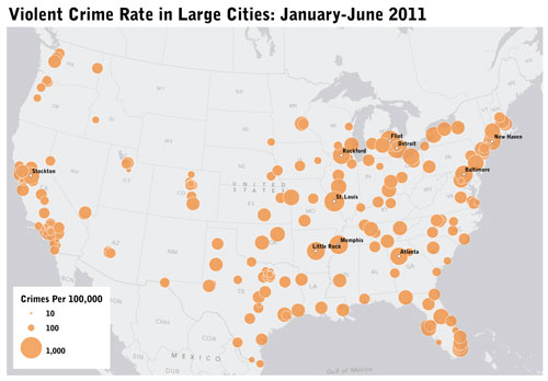
Using the federal data, which covers Jan. to June of this year, I plotted the figures on maps using proportional symbols. This first map shows the violent crime rate (bubble size increases with higher rates) by city.
While large cities like New York, Houston and Los Angeles have more violent crimes, visualizing the rate shows us cities in which residents are more likely to be victims. The rate in St. Louis, Mo., tops all cities with more than 100,000 residents. (The top 10 are labeled on the map).

The second map plots the murder rate, with New Orleans leading all U.S. cities with more than 100,000 residents. (The top 10 are labeled on the map).

Larger versions: Violent crime | Murder