Use Calendar Heat Maps to Visualize Your Tweets Over Time
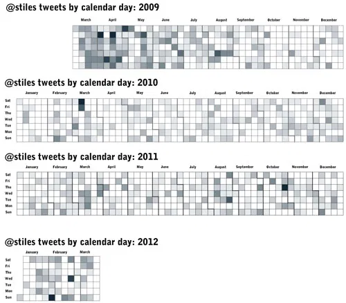
Following Nathan Yau’s excellent tutorial for creating heat maps with time series data (he used vehicle accidents by day for a year), I visualized 3,559 of my tweets back to March 2009.
These maps, created with a modified R script from the tutorial, show how often I sent tweets (both personal and RT), with darker shades representing more activity. It’s fun to go back to the dark days and recall what sparked flurries of tweets:
