Teaching Data Journalism In China

By Matt Stiles | | Topics: Tutorials

I’ve just returned from a week in China, teaching data journalism to students from all over the country at Fudan University (sponsored by the U.S. China Education Trust).

Helped by a fabulous co-instructor, Yan Lu, we taught them about acquiring data, data wrangling, storytelling, visualization, SQL, mapping, news apps and more.

20161104_112129

The students, working journalists and professors, were quite impressive. Working in groups, they created several data-driven projects of their own — a few of which were publishable after just a few days’ work.

For a mapping exercise, students identified several locations by latitude and longitude.

For a mapping exercise, students identified several locations by latitude and longitude.

Students demo their project related to Chinese perception of the U.S. presidential election.

Students demo their project related to Chinese perception of the U.S. presidential election.

I love China, and it was a real honor to be invited to work with such talented group. 谢谢

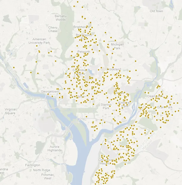
Mapping Crime Data With CartoDB

By Matt Stiles | | Topics: Crime, Tutorials

Today I started playing with CartoDB, an online data mapping service that reminds me in some ways of both Google Fusion Tables and TileMill.

To start, I grabbed a simple test data set — five months of geocoded major crimes in D.C. from January to May this year — to check out some features. One I like is allowing users to query their data in the browser-based interface and filter for specific types of records.

Here, for example, I narrowed the map to show just thefts:

Assaults with deadly weapons:

Vehicle thefts:

Thefts from vehicles:

Robberies:

Homicides:

I made these maps in less than five minutes, so I’m sure there are much more useful stories to tell with the tool. There are also many, many features I didn’t explore, like the ability to style the map using Carto, the CSS-like language, rather than the UI.

Anyway, give it a shot, and let me know what you build.

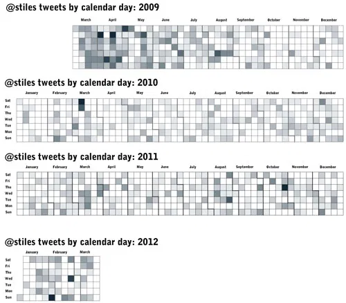
Use Calendar Heat Maps to Visualize Your Tweets Over Time

By Matt Stiles | | Topics: Social Media, Tutorials

Following Nathan Yau’s excellent tutorial for creating heat maps with time series data (he used vehicle accidents by day for a year), I visualized 3,559 of my tweets back to March 2009.

These maps, created with a modified R script from the tutorial, show how often I sent tweets (both personal and RT), with darker shades representing more activity. It’s fun to go back to the dark days and recall what sparked flurries of tweets: