Let's Tess(t)ellate: The Electoral College in Tile Grid Maps, 1980-2012
I recently added some new charting tools here thanks to NPR's excellent daily graphics rig, which we used recently to compare air quality in Seoul with other large cities.
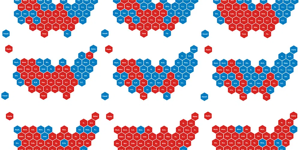
There's still plenty of tinkering to be done here with the rig, especially with deployment to WordPress. But as a first public test, I made several tile grid maps to show Electoral College results in presidential elections since 1980. The "maps" use a tessellated grid of hexagons, rather than actual geographic shapes, to show Republican red and Democratic blue.
This technique can help avoid the perceptual issues readers encounter in traditional "red state, blue state" maps, where large Western states get disproportionately represented. The hex grid shows the data more fairly, but it also isn't quite perfect.
These election maps don't break any new ground, of course, but they might come in handy later this fall. And they were a fun way to test the new tools. Enjoy:
Like the maps? You can make them and plenty of other types of graphics with the rig. It's pretty great.
Update: A new tool for embedding responsive graphics in WordPress.