Charting American Birthdays: Yours Probably Isn't That Special
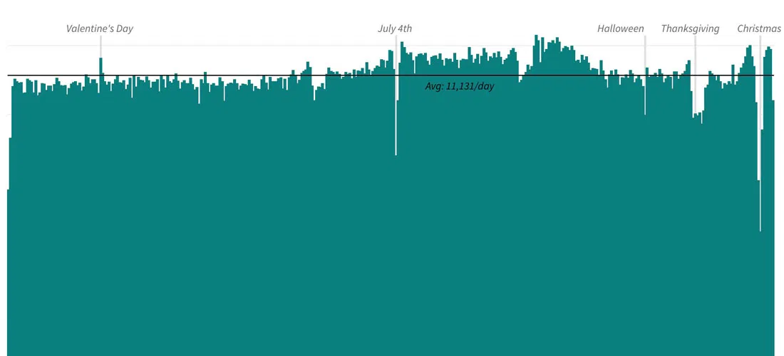
Last week I published a new heatmap exploring the popularity of American birthdays. The chart, which uses darker shades to represent higher average birth counts on specific days, can give the impression that some birthdays are much more common than others.
In reality, outside of some special occasions, namely major holidays, there isn't a huge amount of diversity in the data set, which has two decades of births aggregated by day. Most birthdays, including my own, are fairly average — especially in the first six months of the year. For example: