Posts tagged "d3"
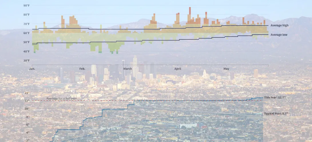
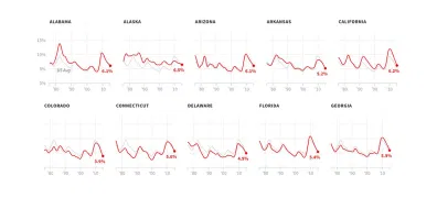
How Wacky Has LA's Weather Been in 2019? These Charts Help Explain
The famously temperate* weather in Los Angeles just can't quite figure itself out this year. This year brought "Snowing in Calabasas!", which was part of the "February to remembrrr", and...
Read more →

Visualizing Verified Twitter's Reaction to Robert Mueller's Investigation
Special Counsel Robert Mueller's now-concluded investigation into the Trump campaign and Russian influence over the 2016 presidential election was obviously a hot topic on Twitter. More than 400,000 tweets — an...
Read more →
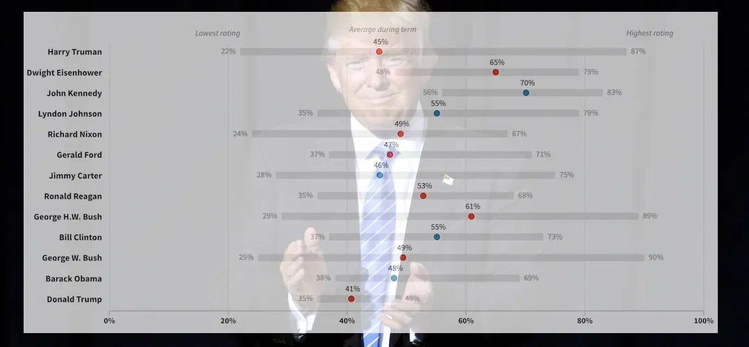
Trump's Approval Ratings are Resilient. How Does that Compare Historically?
Despite all the controversy attached to his presidency, Donald Trump has managed to retain a relatively consistent approval rating in the last two years — especially when compared to predecessors in...
Read more →
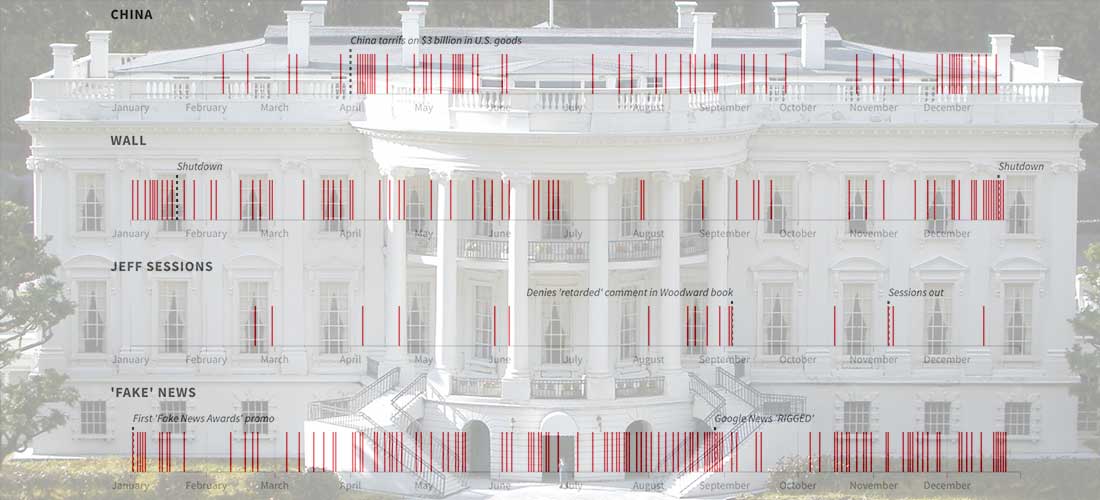
Visualizing a Year of @realDonaldTrump
President Trump thumbed his way through another year in the White House on Twitter, compiling a good (great) collection of 2,930 touts, complaints, defenses and rants. He left 2018 with...
Read more →
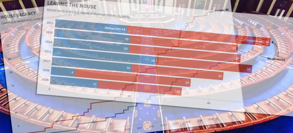
Charting the GOP's Congressional Exodus
Another Republican in the U.S. House — Speaker Paul Ryan, no less — announced his intention not to seek re-election in 2018, adding to the number of members leaving ahead of what's...
Read more →
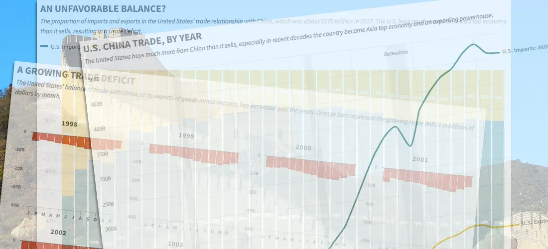
China's Imbalanced Trade with the United States, in Four Charts
A trade war could be looming between the United States and China, fueled by President Trump's fixation on the two nations' unbalanced import-export relationship. The trade imbalance between the two...
Read more →

Chart: Republican Attacks on the FBI Have Worked, Especially on Republicans
HuffPost is out with an interesting poll about the the public's trust in the FBI, which has been under attack recently for its role in the investigations of Hillary Clinton...
Read more →

Visualizing #NICAR18, Part II
I posted recently about the NICAR journalism conference, held this year in Chicago — and it turns out news nerds like to tweet. To keep track of all the conference chatter,...
Read more →

Visualizing the News Nerd Conference Known as #NICAR18
I'm in the United States this week to attend the annual news nerd conference known as NICAR, a diverse gathering of reporters, editors and developers (and others) focused on storytelling...
Read more →
Jobless Claims at Five-Decade Low
The number of Americans filing claims for unemployment benefits hasn't been this low since Richard Nixon was president, according to new data from the U.S. Labor Department. The figures suggest...
Read more →

How China's Economic Retaliation Hurt the South Korean Tourism Industry
I wrote this week about the one-year anniversary of China's economic retaliation against South Korea over the THAAD missile system, a defensive weapon designed to stop North Korea's medium-range missiles....
Read more →

Tracking Historical Twitter Followers: @elisewho vs. @stiles
My wife (@elisewho) and I (@stiles) had a silly social media moment yesterday when I replied to one of her tweets — despite the fact that she was sitting in an...
Read more →
Who's Competing at Pyeongchang? A Breakdown By Sports, Nations, Genders
More than 2,900 athletes from 92 nations and territories are competing in the Winter Olympics in Pyeongchang, South Korea. The event has 15 different sports (and many events within each)....
Read more →

Which Countries Sent the Most Athletes to Pyeongchang?
Because I live in Seoul and work as a journalist, I'm paying close attention to the Winter Olympics as they open tonight in Pyeongchang, South Korea. I don't know much...
Read more →

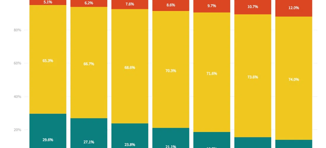
Visualizing the Historical Relationship Between White, Black Unemployment Rates
President Trump was right last month when he bragged that black unemployment rate was at a historical low. The rate in December was 6.8 percent, the lowest it's been since...
Read more →

Visualizing Income Equality in Major World Economies
Years after a global crisis, the world's largest economies are again growing, The New York Times reported over the weekend. Every major economy on earth is expanding at once, a...
Read more →

The Curious Case of South Korea's Vanishing Washing Machine Exports
The Trump administration last week announced that it planned to impose higher fees, known as tariffs, to countries that export washing machines and solar panels the United States. The tariffs,...
Read more →

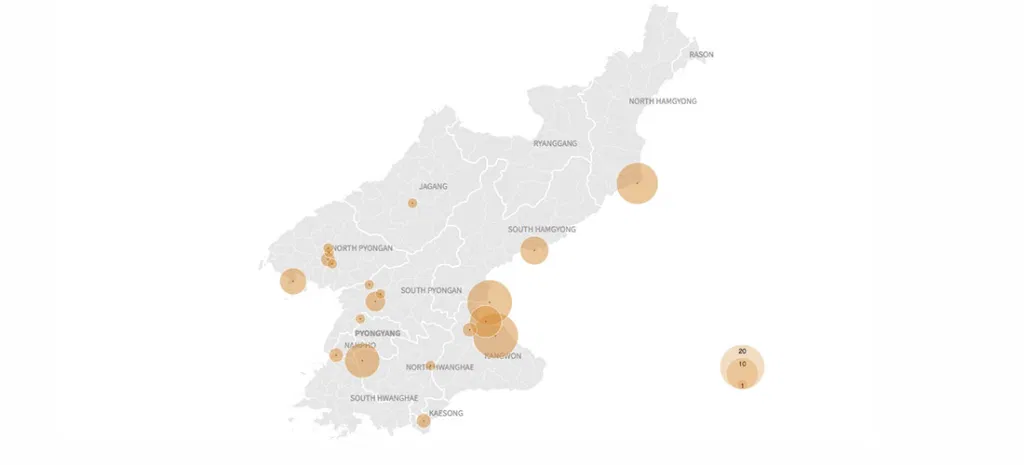
Mapping the United States' Korean Population
I've often felt fortunate that I get to write about South Korea for the Los Angeles Times, a newspaper that's still interested in stories related to life, politics and culture...
Read more →
It's Been a Hot Summer, Down Under
My family is vacationing this week in Mosman, Australia, a harbourside Sydney suburb near Balmoral Beach known for its family friendly attractions and boutique shops. This place is a great...
Read more →

America Imports Lots of Stuff from China, Including Christmas Decorations
Last year, the United States imported more than $460 billion in goods — clothes, toys, gadgets, you name it — from China. Of course, our Christmas decorations were on that list,...
Read more →

Visualizing More Than a Decade of North Korean Defections
Another North Korean soldier defected at the Demilitarized Zone on Thursday, causing a brief skirmish along the highly fortified border. He was the fourth solder to defect this year, including...
Read more →

North Korean 'Provocations' Freeze During Winter?
Last week I posted a visual timeline highlighting nuclear, missile and other "provocations" by the North Korean regime since 2006. The data show a clear escalation, especially in missile tests,...
Read more →

Visualizing North Korean 'Provocations': A Timeline
Until the recent incident involving a defecting soldier, tensions between the United States and North Korea had cool slightly, largely because the communist regime hasn't committed any so-called "provocations" — ballistic...
Read more →

Common Ground Between North and South Korea: Aging and Shrinking Populations
The birth rate in South Korea, where I live and work, hit a record low this year, leading to concern about the impact an aging (and, eventually, shrinking) population might...
Read more →
Visualizing North Korea's Missile Launches
Despite international objections, North Korea has launched four ballistic missiles in the last week, including one that flew over Japan, raising regional tensions about the rogue state's weapons development even...
Read more →
Charting North Korean Provocations. A Case of 'The Mondays'?
As a newspaper reporter living in South Korea, I'm always aware that a "provocation" by our friends in the North — a missile launch, a nuclear test, or some other incident...
Read more →
Mapping Opposition to the GOP Health Care Bill by Congressional District
The legislative failure of the GOP's replacement for Obamacare has been widely reported, obviously, but I remain interested in one bit of polling noted this week by FiveThirtyEight. The polling...
Read more →
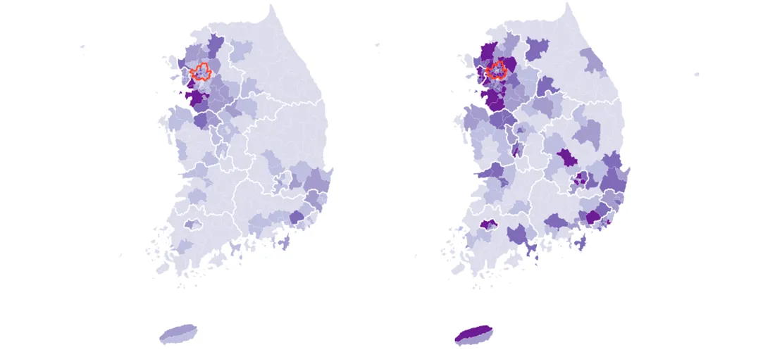
Mapping South Korea's Total and Foreign Populations — by Municipal District
South Korea, my adopted home for almost two years, has about 50 million residents as of the last census, in 2015. Most of them are settled in the country's urban...
Read more →
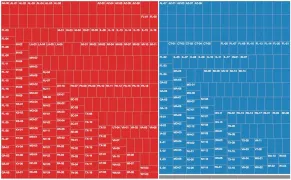
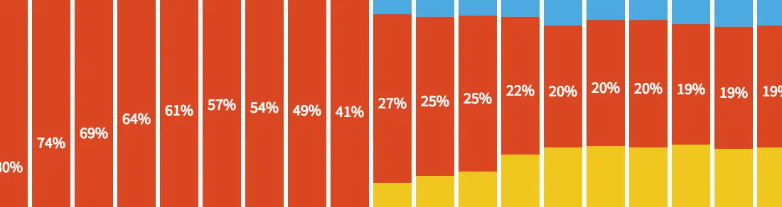
Four Decades of State Unemployment Rates, in Small Multiples, Part 2
I posted recently about how the state-by-state unemployment rate has changed during my lifetime. The result was a small multiples grid that put the states in context with one another....
Read more →
Four Decades of State Unemployment Rates, in Small Multiples
There's good news this week in the monthly jobs report, the latest sign that the economy, however grudgingly, has healed from the financial crisis nine years ago: The unemployment rate...
Read more →
Charting Historical Voter Turnout
As FiveThirtyEight notes, turnout in the 2016 presidential election isn't dramatically lower than it was four years ago, according to the latest estimates. And with many mail-in and provision ballots...
Read more →

Mapping Where 'Americans' Live
Back during the Republican primaries, The Upshot published an interesting short post called the Geography of Trumpism. The reporters back then analyzed hundreds of demographic variables, by county, in an...
Read more →
Charting MLB Division Races
Earlier I used small multiples to show how each Major League Baseball team's 2016 season progressed relative to the .500 line. Here are those same line charts, but this time...
Read more →
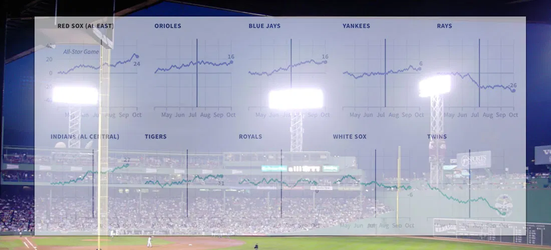
How Far Above (Or Below) .500 Did Each MLB Team Finish This Season?
I live in South Korea, where it isn't always easy to watch American baseball (unless you're a fan of the Los Angeles Dodgers or the Texas Rangers). So I'm catching...
Read more →
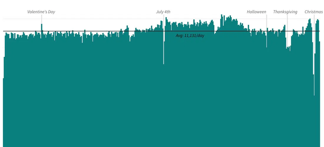
Charting American Birthdays: Yours Probably Isn't That Special
Last week I published a new heatmap exploring the popularity of American birthdays. The chart, which uses darker shades to represent higher average birth counts on specific days, can give...
Read more →

How Common is Your Birthday? This Visualization Might Surprise You
I've made a fully interactive version of this visualization at BirthdayRank.com. See how your birthday ranks, discover which celebrities share it, check your zodiac sign's popularity and compare with friends....
Read more →
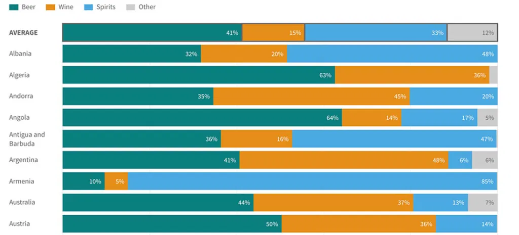
Visualizing World Alcohol Consumption: What Beverages Do Countries Prefer?
I posted recently about how countries consume different amounts of alcohol — and how some have wider gender gaps when it comes to booze. The previous posts relied on two...
Read more →
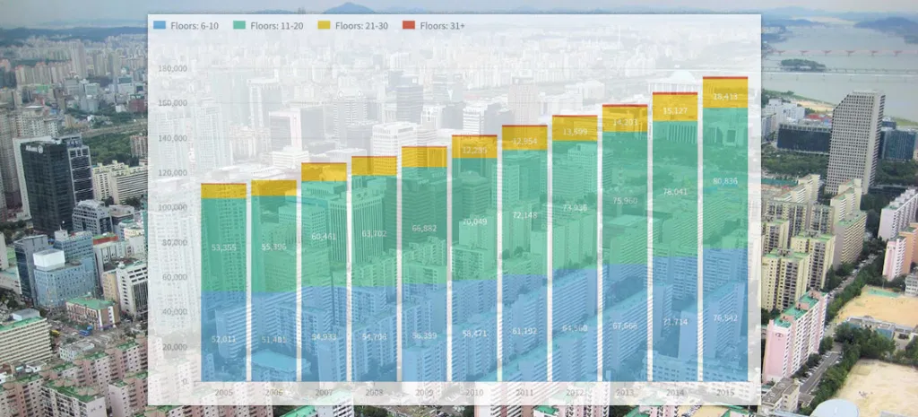
South Korea's (Residential) Rise: How Building Heights, Home Sizes Vary
Note: I followed my wife, a foreign correspondent for NPR News, to Seoul last year. This is one of a series of posts exploring our adopted country's demographics, politics and...
Read more →
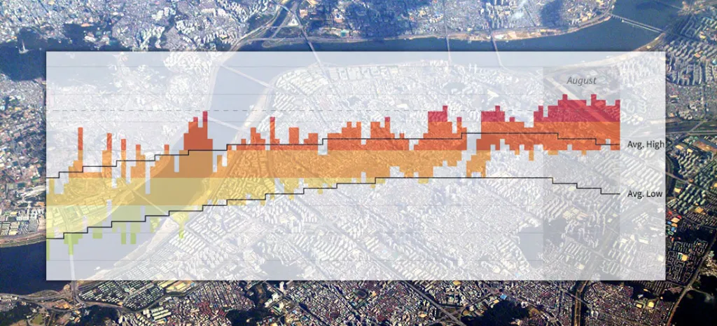
Seoul's Steamy Summer (Updated)
Note: I followed my wife, a foreign correspondent for NPR News, to Seoul last year. This is one of a series of posts exploring our adopted country's demographics, politics and...
Read more →
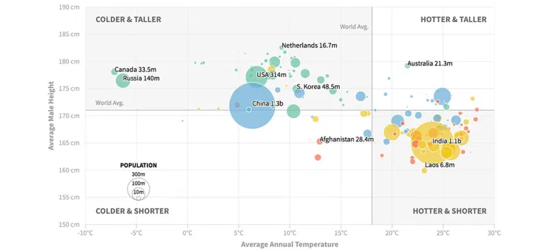
Are People in Colder Countries Taller? (Continued...)
Earlier this week I posted two scatterplots examining the relationship between a country's average temperature and its male residents' average height. The data show some correlation, but there probably are...
Read more →
Are People in Colder Countries Taller?
I got married in Amsterdam. One thing I remember most about my time in The Netherlands is the obvious height of the locals. Both men and women, generally, are quite...
Read more →

Charting Taiwan's Sea of Scooters
[caption id="attachment_2591" align="alignnone" width="840"] Scooters at a Taipei intersection. Credit: Quatro Valvole/Wikimieda[/caption] I'm in Taiwan this month to study Mandarin. During breaks, I'll be posting occasionally about the island nation's...
Read more →
Charting Taiwan's Low Birth Rate, Aging Population
I'm in Taiwan this month to study Mandarin. During breaks, I'll be posting occasionally about the island nation's demographics, politics and (sticky) weather. Like other East Asian democracies, such as...
Read more →
Is South Korea's National Assembly More Liberal Than South Koreans?
Members of South Korea's legislative branch, known as the National Assembly, recently took a poll to determine where they land on the ideological spectrum. The group as a whole appears...
Read more →
Charting New York City's Changing Borough Population, Over Time
I woke one recent morning at 5 a.m. obsessing about, of all things, the people of New York City — specifically how the population is distributed among the five boroughs: Brooklyn,...
Read more →
How Much Differently Do Men and Women Drink Alcohol — By Country
A few months ago, I wrote about the novelty of a McDonald's selling beer at one of its restaurants in South Korea — a first for the fast-food giant in...
Read more →
Editing O.J. Simpson: Charting Changes to His Wikipedia Page
I've just finished watching ESPN's fabulous O.J.: Made in America, a five-part documentary about the Hall of Fame football player. Somewhere in the process of digesting this latest — and,...
Read more →
How Immigration is Animating the 'Brexit' Vote, in Four Charts
Immigration to the United Kingdom has risen sharply in recent years, and it's fueling the debate about Britain's looming "Brexit" vote on whether to leave the European Union. Many supporters...
Read more →
Air Quality in Seoul, China, U.S.
[caption id="attachment_2325" align="aligncenter" width="1000"] The view from our apartment in Seoul. Some days are better than others.[/caption] The air quality in Seoul — a mega city home to 70,000 taxis and...
Read more →