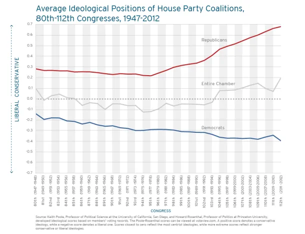
Charting Partisan Polarization in Congress
The Fix today has a post about the newly released digital version of Vital Statistics on Congress, a partnership between between a few think tanks that contains reams of enlightening data about the institution.
Among the more interesting examples is a table showing the partisan polarization ov...
Read more →
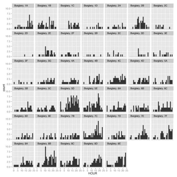
Sketching D.C. Crime Data With R
A car burglar last week nabbed a radio from our car, prompting me to think (once again) about crime in Washington, D.C., where I live.
I wanted to know if certain crimes were more common in particular neighborhoods, so I downloaded a list of every serious crime in 2012 from the city's data port...
Read more →
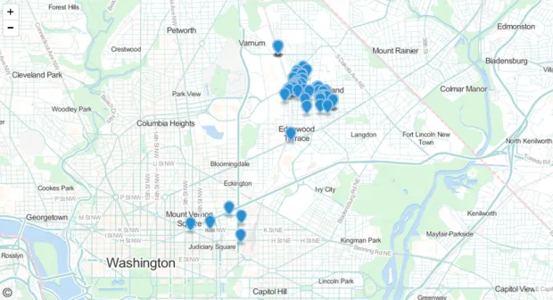
Mapping GeoJSON On Github
I've been hoping to tinker with Github's new mapping service since the company announced it earlier this month. Turns out it's quite easy. You just commit a GeoJSON file to your repo, and voilà.
The points on this simple map represents the location of each car2go I've rented (excluding those in...
Read more →
Mapping 'Majority Minority' Presidential Results
Yesterday I mapped the more than 350 "majority minority" counties in the United States, breaking them down by race and ethnicity groups and geography. As promised, today I've looked at how these counties (in the contiguous United States) voted in the 2012 election.
Obama won about 70 percent of...
Read more →
Mapping 'Majority Minority' Counties
This week the U.S. Census Bureau released updated national population estimates, including a list of the counties that grew most rapidly from 2010 to last summer. I wrote about these counties in a political context this week for work.
Included in the release was a note that six more counties h...
Read more →
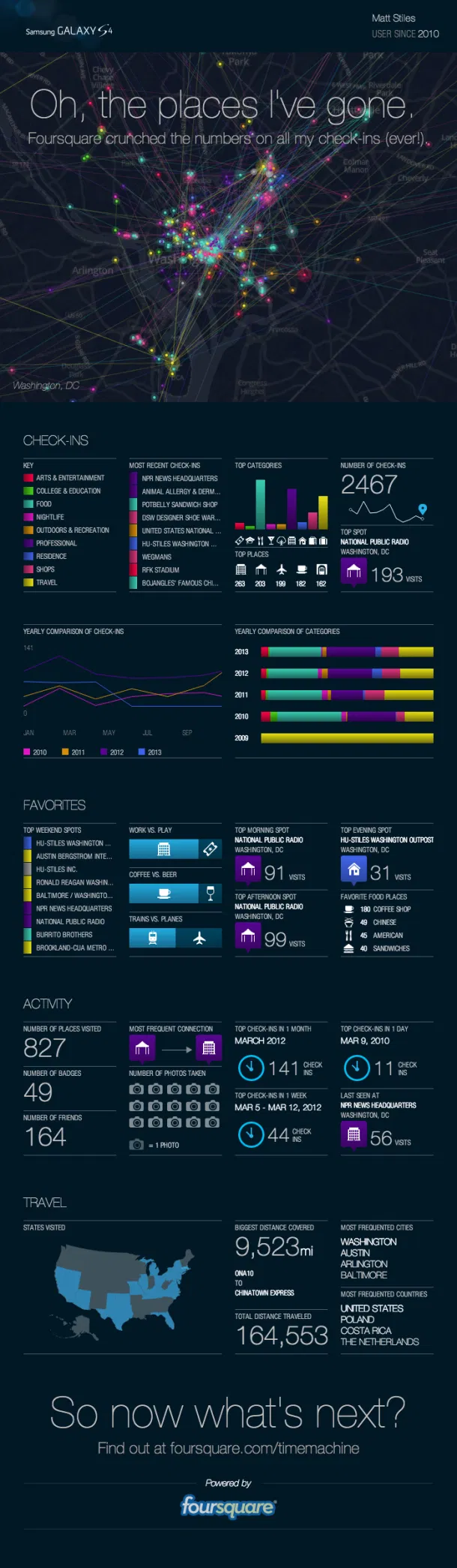
Tracking Check-ins With Foursquare Time Machine
Location-based service Foursquare recently released a new feature allowing users to track their past checks by location, venue type and other metrics The browser app visualizes check-ins in sequential order, creating a colorful map and ultimately a personalized infographic.
Apparently, I've ch...
Read more →
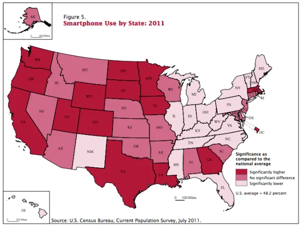
Mapping Smartphone Use By State
Today at work I wrote a quick blog post about a new U.S. Census Bureau report on Internet use in America. The report suggested that smartphones were helping decrease the digital divide of access to the Web among blacks and Hispanics.
The U.S. Census Bureau survey was the first time the agency a...
Read more →
Birthday Heatmap Born Again
Last year on my birthday I created a quick heatmap visualizing birthdays by their rank on the calendar. Despite its flaws, the graphic went viral by The Daily Viz standards, receiving a quarter million views.
Most of the attention came in the month of May 2012. But what's been interesting is i...
Read more →
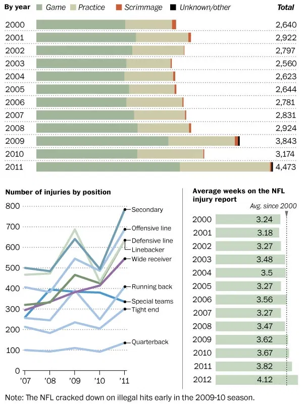
Charting NFL Injuries
The Washington Post has a fascinating story today about NFL players and injuries, with the local peg being Robert Griffin III's knee injury. The gist:
Interviews with more than 50 doctors, players, agents, owners and medical ethicists suggest that what the NFL Physicians Society calls the game’...
Read more →
Charting The Premier League Season
Last fall I posted some Tufte-inspired sparkline charts to visualize how Major League Baseball teams fared during the 2012 season.
I've created something similar for clubs in the English Premier League, where the season is winding down with Manchester United holding a strong lead in points. Th...
Read more →