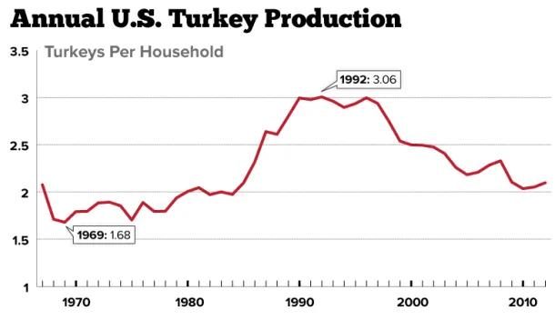
Charting Americans' Turkey Consumption Per Household: 1967-2012
Americans who celebrate Thanksgiving generally enjoy a good bird, myself included. But is that the case in some years more than others?
This chart shows turkey production (254 million this year) normalized by the number of households estimated each year by the U.S. Census Bureau. In the sixtie...
Read more →
Charting MLB Standings With Tufte-Inspired Sparklines
Last week I attended a day-long session with Edward Tufte, the "Leonardo Di Vinci of data," as The New York Times once dubbed him. The session has inspired me to take the blog off paternity leave. About time.
Inside Tufte's book "Beautiful Evidence" is a section on "sparklines," which are smal...
Read more →
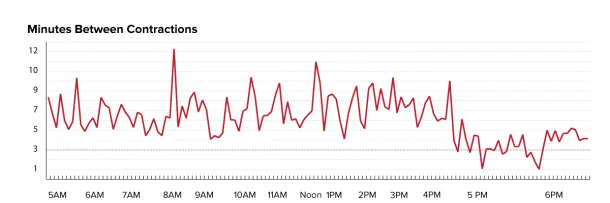
The Viz On Paternity Leave
My wife Elise gave birth to a baby girl on Saturday, meaning it's time for me to take a guilt-free vacation from the blog, which I've been neglecting already in recent weeks.
Meanwhile, here's a parting viz, showing the interval between her contractions as we labored from home. They began aroun...
Read more →
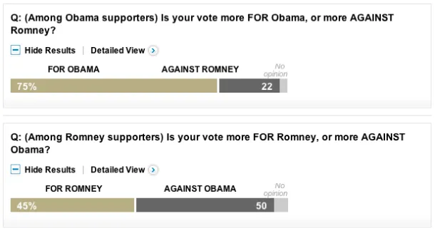
Charting Presidential Voting Motives
These two charts from the latest Washington Post poll are interesting. They show what's motivating likely voters in the presidential race. President Obama's supporters are largely voting for him. Mitt Romney's supporters, however, are voting to oust Obama:
Read more →

Mapping Health Insurance By County
The U.S. Census Bureau recently released estimates for insurance rates by county. This interactive map shows those rates, with darker shades representing higher uninsured rates:
View the larger, interactive version here.
Read more →
Charting Baby Gender, Birth Date
My wife and I had friends over last night, and we asked 20* of them to guess a few critical stats about our impending baby (among the reasons this blog hasn't exactly been "daily" lately).
Here's how they guessed on birth date (the official due date is Sept. 24):
They were split on gender (w...
Read more →
Analyzing Convention Speeches
The New York Times created two nifty interactive bubble charts to represent the frequency of words used at the respective political conventions.
First, the Republicans:
And the Democrats (so far):
We'll see what this looks like after Thursday night.
Read more →
Humidity, Sunshine Across The U.S.
With summer winding down, I wondered: How much does the amount of sunshine and humidity vary among U.S. cities?
First, this map shows the average percentage of possible sunshine by city. (Yuma, AZ, has sun about 90% of the year; Juneau, AK, gets it about 30%). Larger bubbles represent higher p...
Read more →
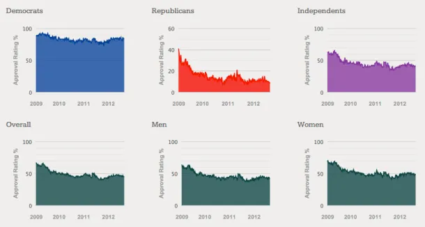
Obama Approval Rating Charts Updated
A few months ago I posted a dashboard of 21 interactive charts comparing President Obama's approval rating among different groups (men vs. women, Democrats vs. Republicans, rich vs. poor, etc.). I've updated the charts with the most recent Gallup data:
See the charts, and download the data.
Read more →
Mapping Apollo Missions
This is sad news:
Neil Armstrong, the Apollo 11 astronaut who became the first human being to set foot on another world, has died. He was 82.
Thanks to Google Moon, you can revisit Armstrong's historic mission — and those of other astronauts in the Apollo series:
The site features lunar tours,...
Read more →