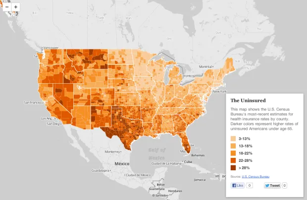
The U.S. Census Bureau recently released estimates for insurance rates by county. This interactive map shows those rates, with darker shades representing higher uninsured rates:
View the larger, interactive version here.
By Matt Stiles Topics: Demographics
The U.S. Census Bureau recently released estimates for insurance rates by county. This interactive map shows those rates, with darker shades representing higher uninsured rates:
View the larger, interactive version here.
One thought on “Mapping Health Insurance By County”