Candidate Fundraising vs. Super PAC Spending in January
From Huffington Post:
Reports about January’s fundraising numbers, released on February 20, have focused on two narratives: Mitt Romney’s limited fundraising and high burn rate and the role that super PACs are playing in an increasingly contested Republican primary. HuffPost decided to combin...
Read more →
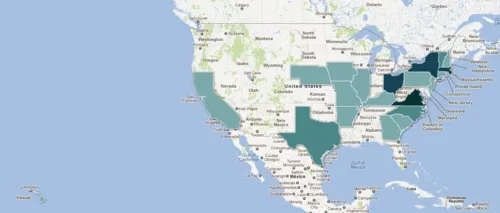
Mapping the Birthplaces of U.S. Presidents
Since I get the day off, I figured I should repay our presidents by honoring their birthplaces with two maps made with Google Fusion Tables. This first map places points on their home towns (see larger interactive version):
Here’s the same data but aggregated by state and mapped with polygons...
Read more →
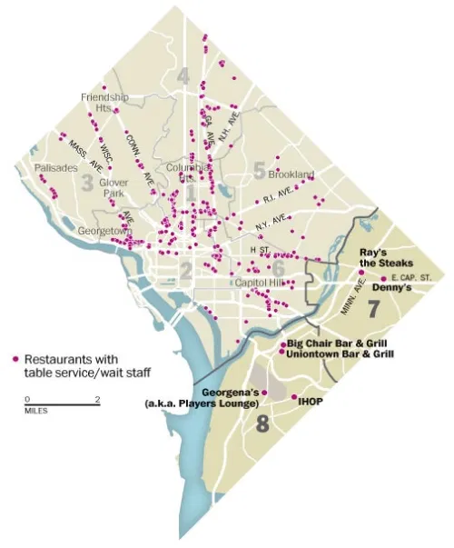
DC's 'Dining Desert'
The Washington Post has a story today about the lack of sit-down restaurants across the Anacostia River in neighborhoods that are among the poorest in the city.
For decades, the main arteries east of the Anacostia River have been dominated by carry-out joints and fast-food chains, their menus...
Read more →
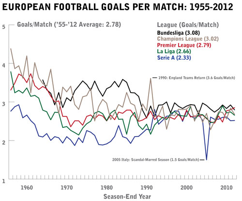
Which European Soccer Leagues Have The Most Per-Match Goals?
Has European football gotten increasingly boring over the years? If you like offense, perhaps.
Since the mid-1950s, fewer and fewer goals on average have been scored per match. The trend is evident among the major national leagues (Spain, Italy, England and Germany) and also the Champions Leagu...
Read more →
Facebook By The Numbers
Via the Economist:
AFTER eight years, scores of lawsuits and a blockbuster movie, Facebook is going public. It is seeking to raise $5 billion from its initial public offering, which would give it an estimated market capitalisation of $80-100 billion—similar to that of fast-food chain McDonald...
Read more →
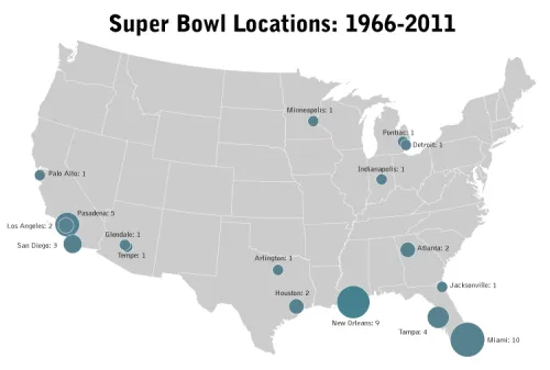
Charting Super Bowl History
Last night’s Super Bowl is one of only a few such contests held in the northern United States — all inside domed stadiums. This map shows the cities that hosted previous games and uses proportional symbols to show how many were played there:
Data source: Pro-football-reference.com
Read more →
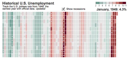
WSJ Unemployment Tracker
The Wall Street Journal posted an interactive heat map to visualize the unemployment rate nationally over time. The backstory from the latest numbers:
Under the government’s definitions, people only count as unemployed when they’re actively looking for work. So when the unemployment rate drop...
Read more →
Charting Recessions and Recoveries
Amanda Cox from The New York Times charted the current downturn compared with history:
Horizontal axis shows months. Vertical axis shows the ratio of that month’s nonfarm payrolls to the nonfarm payrolls at the start of recession. Note: Because employment is a lagging indicator, the dates for...
Read more →
FACEBOOK: Who uses it and what are they doing?
pewinternet:
On an average day:
15% of Facebook users update their own status.
22% comment on another’s post or status.
20% comment on another user’s photos.
26% “Like” another user’s content.
10% send another user a private message
A snapshot of sex/age distribution by social networking sit...
Read more →
sunfoundation: Maps of the Drug War in Mexico Homicides and Trafficking Routes
[caption id="attachment_53" align="alignnone" width="620" caption="sunfoundation: Maps of the Drug War in Mexico Homicides and Trafficking Routes"][/caption]
Read more →