Posts tagged "birthday"
How Common is Your Birthday? This Visualization Might Surprise You
I've made a fully interactive version of this visualization at BirthdayRank.com. See how your birthday ranks, discover which celebrities share it, check your zodiac sign's popularity and compare with friends....
Read more →
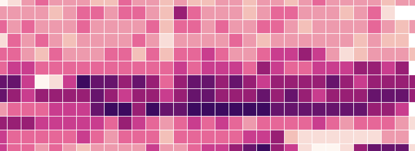
Birthday Heatmap Born Again
Last year on my birthday I created a quick heatmap visualizing birthdays by their rank on the calendar. Despite its flaws, the graphic went viral by The Daily Viz standards,...
Read more →
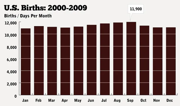
How Common Is Your Birthday? Pt. 2.
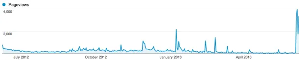
Last weekend's birthday heatmap post has been hugely popular by The Daily Viz standards, drawing in more than 100,000 readers and tons of social media attention. While I'm excited about...
Read more →
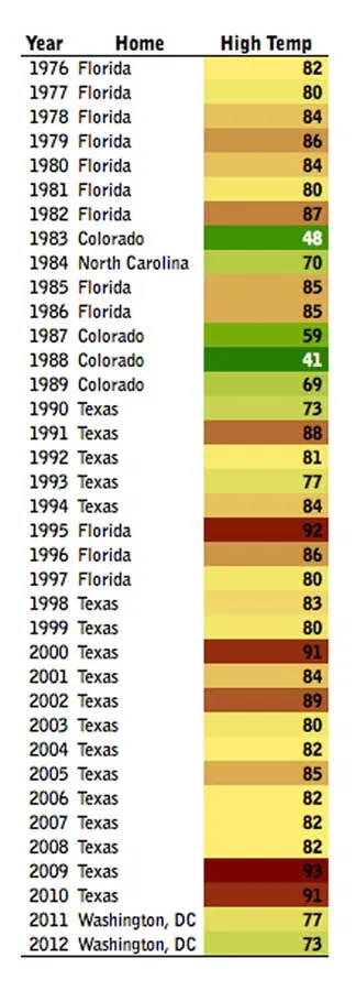
A Below-Average Birthday
Today's my birthday, and the weather is great. What's it been like for past birthdays, I wondered. The answer: All over the place (sort of like my parents' moving choices)....
Read more →