Posts tagged "Column Chart"
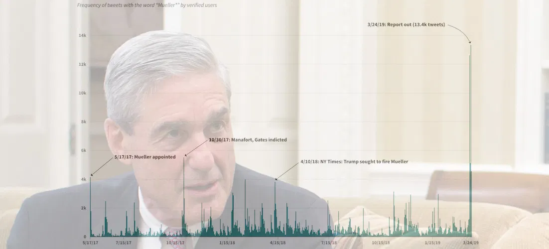
Visualizing Verified Twitter's Reaction to Robert Mueller's Investigation
Special Counsel Robert Mueller's now-concluded investigation into the Trump campaign and Russian influence over the 2016 presidential election was obviously a hot topic on Twitter. More than 400,000 tweets — an...
Read more →
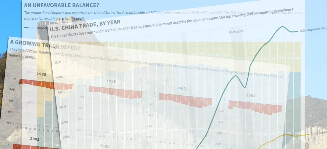
China's Imbalanced Trade with the United States, in Four Charts
A trade war could be looming between the United States and China, fueled by President Trump's fixation on the two nations' unbalanced import-export relationship. The trade imbalance between the two...
Read more →

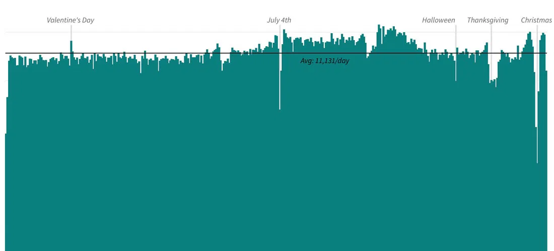
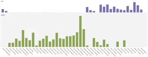
Visualizing #NICAR18, Part II
I posted recently about the NICAR journalism conference, held this year in Chicago — and it turns out news nerds like to tweet. To keep track of all the conference chatter,...
Read more →
Charting North Korean Provocations. A Case of 'The Mondays'?
As a newspaper reporter living in South Korea, I'm always aware that a "provocation" by our friends in the North — a missile launch, a nuclear test, or some other incident...
Read more →
Charting American Birthdays: Yours Probably Isn't That Special
Last week I published a new heatmap exploring the popularity of American birthdays. The chart, which uses darker shades to represent higher average birth counts on specific days, can give...
Read more →
Charting Taiwan's Low Birth Rate, Aging Population
I'm in Taiwan this month to study Mandarin. During breaks, I'll be posting occasionally about the island nation's demographics, politics and (sticky) weather. Like other East Asian democracies, such as...
Read more →
Charting New York City's Changing Borough Population, Over Time
I woke one recent morning at 5 a.m. obsessing about, of all things, the people of New York City — specifically how the population is distributed among the five boroughs: Brooklyn,...
Read more →
Editing O.J. Simpson: Charting Changes to His Wikipedia Page
I've just finished watching ESPN's fabulous O.J.: Made in America, a five-part documentary about the Hall of Fame football player. Somewhere in the process of digesting this latest — and,...
Read more →
Charting Baby Gender, Birth Date
My wife and I had friends over last night, and we asked 20* of them to guess a few critical stats about our impending baby (among the reasons this blog...
Read more →
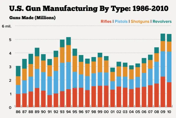
Charting U.S. Gun Manufacturing
More than 5 million guns were made in the United States in 2010, according to the latest data available from the U.S. Bureau of Alcohol, Tobacco, Firearms and Explosives, among...
Read more →
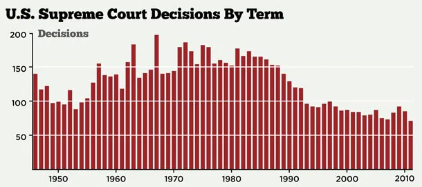
Charting SCOTUS Decisions Over Time
The U.S. Supreme Court is expected to release rulings on key cases over the next week, including the much-awaited decision on the Affordable Care Act. The court has seen its...
Read more →
Charting Post Offices
The U.S. Postal Service is still struggling to compete in an era of declining paper mail, and as private industry and Congress have resisted its efforts to reform, according to...
Read more →

Tiger's Worst Masters
The Associated Press captures the performance well: Tiger Woods arrived at Augusta National as a favorite to win his fifth green jacket. Instead, he left with his worst score as...
Read more →
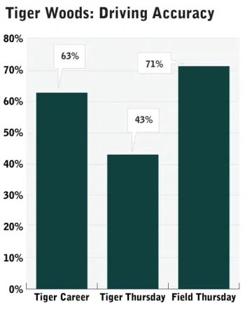
Tiger's Tee Troubles
Tiger Woods struggled off the tee yesterday at the Masters, a key reason he’s tied for 29th in a tournament in which many picked him as the favorite. Tiger’s driving...
Read more →
NFC vs. AFC: Charting Four Decades of 'Pro Bowl' Scores
The two NFL conferences have split victories almost evenly in their annual Hawaii showdown/snoozefest known as the Pro Bowl, with the NFC holding a 21-20 record against the AFC. This...
Read more →
How 'State of the Union' Speeches Changed Over Time
Tonight President Obama gives his third “State of the Union” speech, an address that dates back to George Washington. Over time, the length and format of the speech has changed,...
Read more →
The Cowboys' 'Unsweet 16'
Oh, Cowboys:
Via Seth Schrock
Read more →
Charting War Fatalities
The Washington Post this morning reports on Army Spec. David Hickman, who died last month in Bagdad, the victim of a roadside bomb. The paper notes that Hickman could very...
Read more →
How Robert Griffin III's Heisman Ballot Compares to Past Winners
Last night Robert Griffin III became the first Baylor football player to win the Heisman Trophy, the college game’s highest honor. Griiffin was the 76th player to receive the award...
Read more →
Icing NFL Kickers
Genius, via @zachwill:
Go Cowboys!
Read more →
Charting NFL Receptions
Another Sunday, another NFL viz — this one showing the growth in total receptions by the league’s top receiver each season:
Top receiver by yards:
Data Source: Pro-Football-Reference.com
Read more →
Walk-Off Home Run History
Turns out game-ending home runs — like last night’s centerfield shot by St. Louis Cardinals infielder David Freese — are more common than I imagined. There have been nearly 3,000...
Read more →
Charting Troops in Iraq
President Obama on Friday announced that U.S. troops would be leaving Iraq by year’s end. The New York Times’ take: The president’s statement, coming a day after a NATO air campaign...
Read more →
Charting Twitter Stats
One hundred is the new 140 on Twitter, according to my wife. How am I doing? My tweets since August 2009: Tweets: 1523. Average tweet: 89 characters. Longest tweet: RT...
Read more →
English Premier League Wins, Goals
Today’s match between Manchester United and Chelsea could well decide who wins the English Premier League title this season. Of course, both teams are comfortable in this position, having dominated...
Read more →
Financing Texas Elections: 2010
Another cross-post from my work blog: The 2010 political campaigns are over, but looking back at the fundraising and spending that financed them is now fully possible thanks to records...
Read more →